

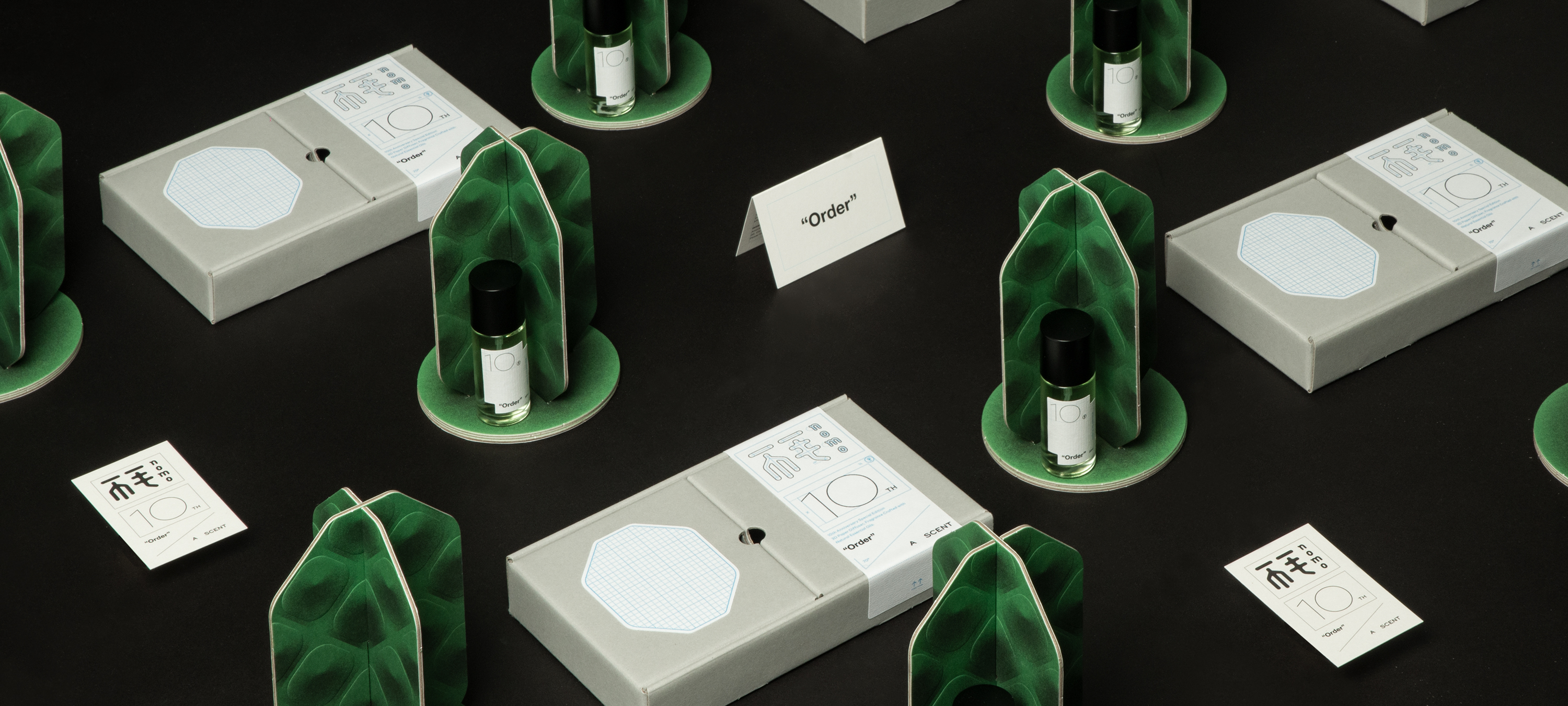
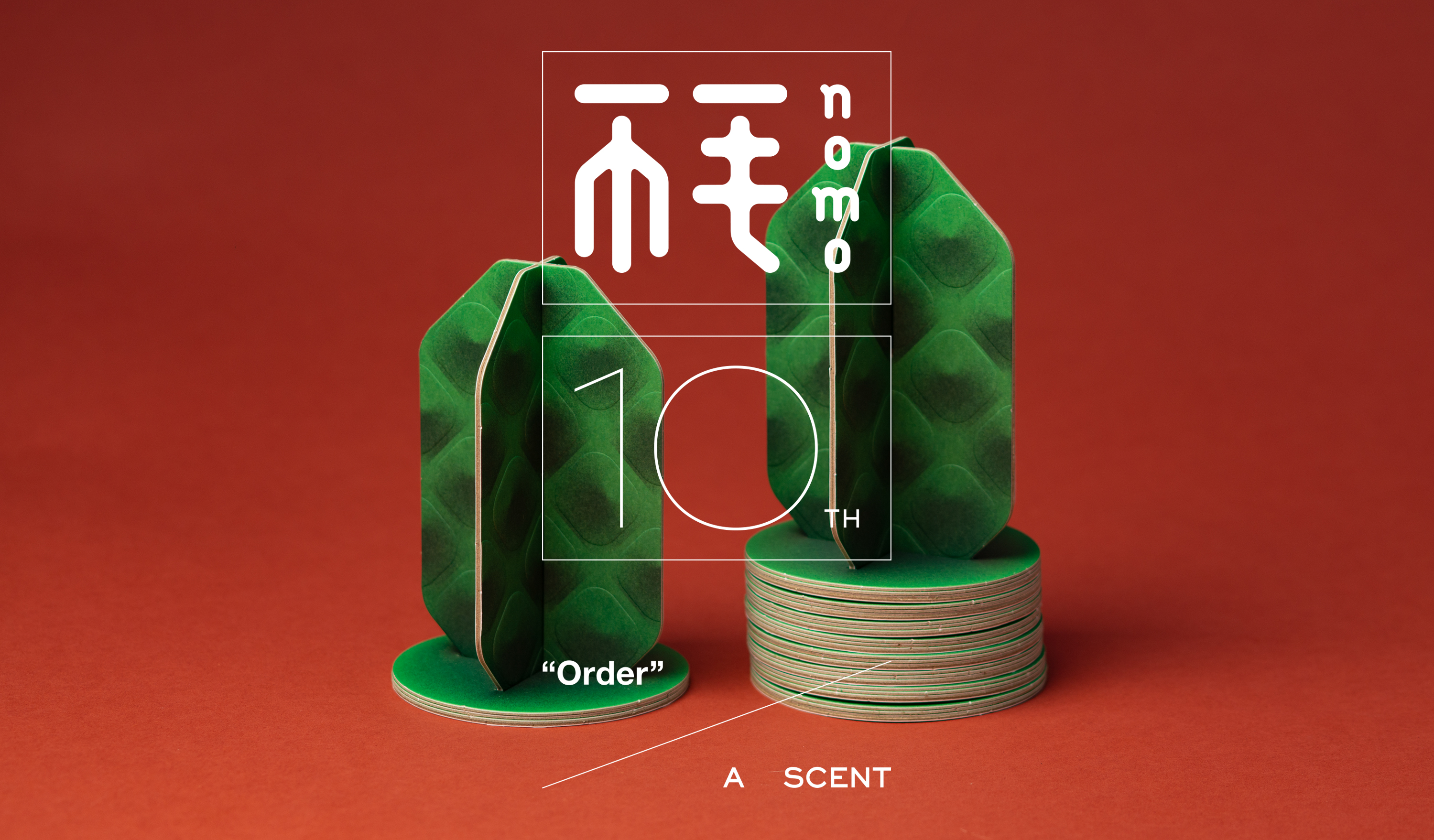
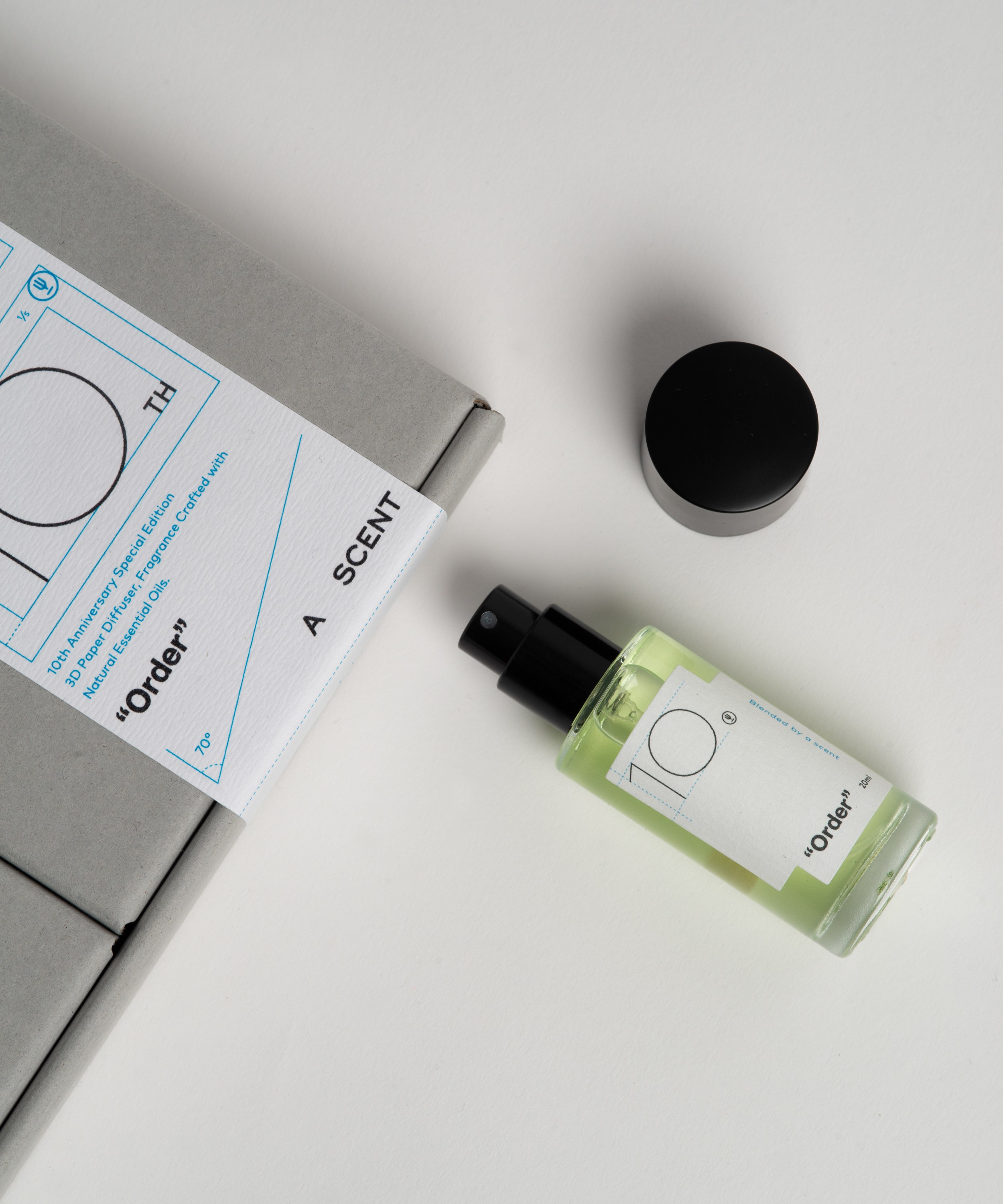
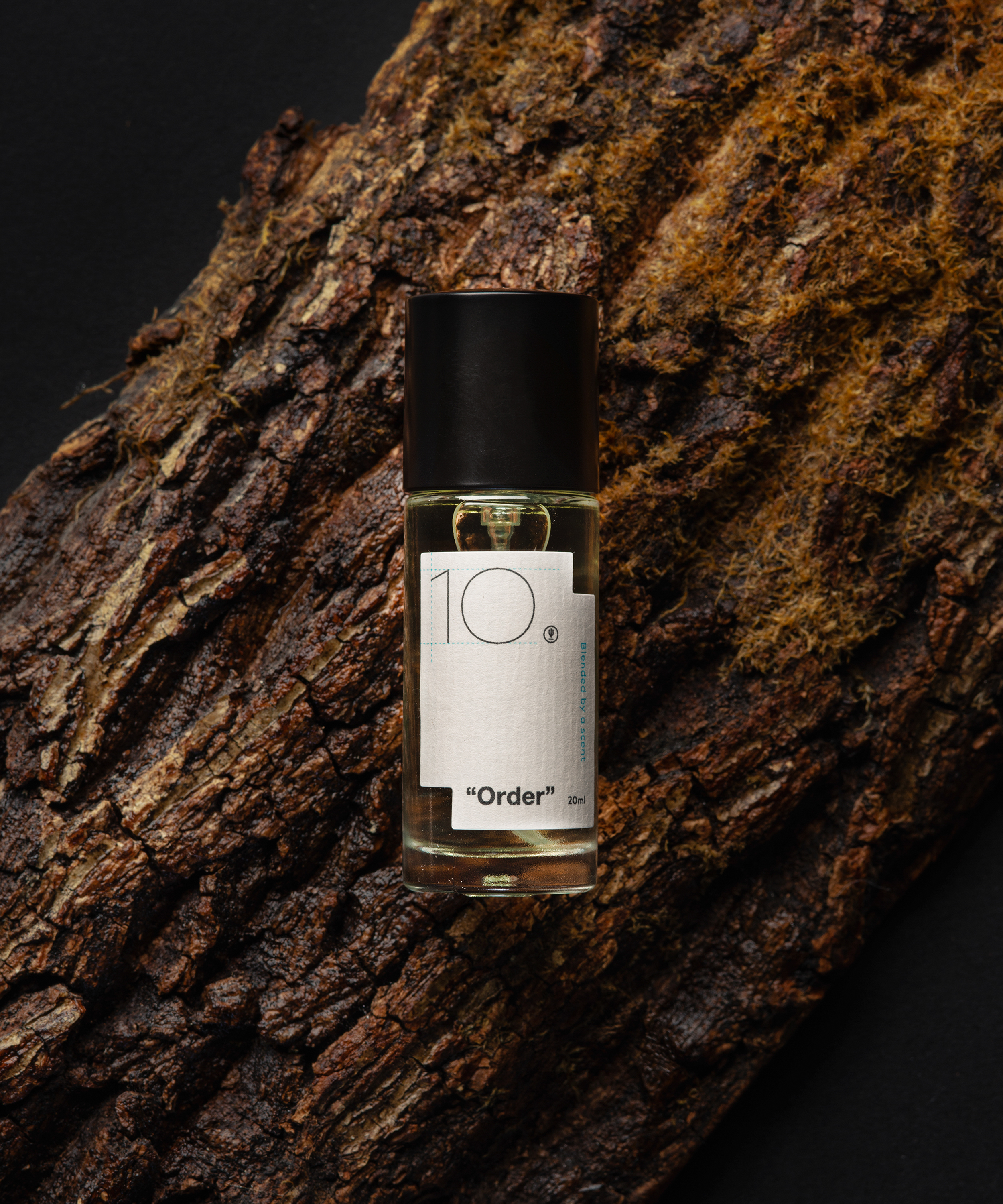
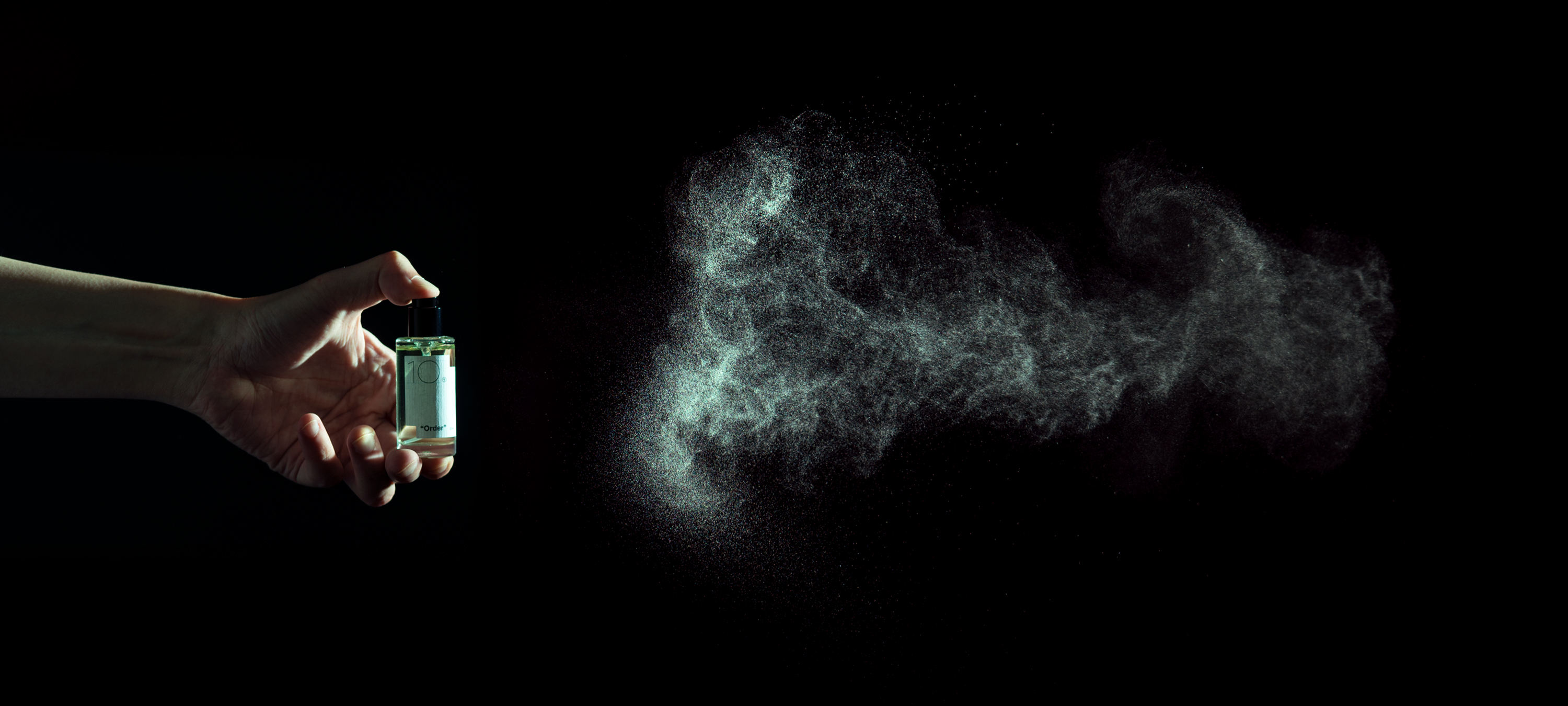
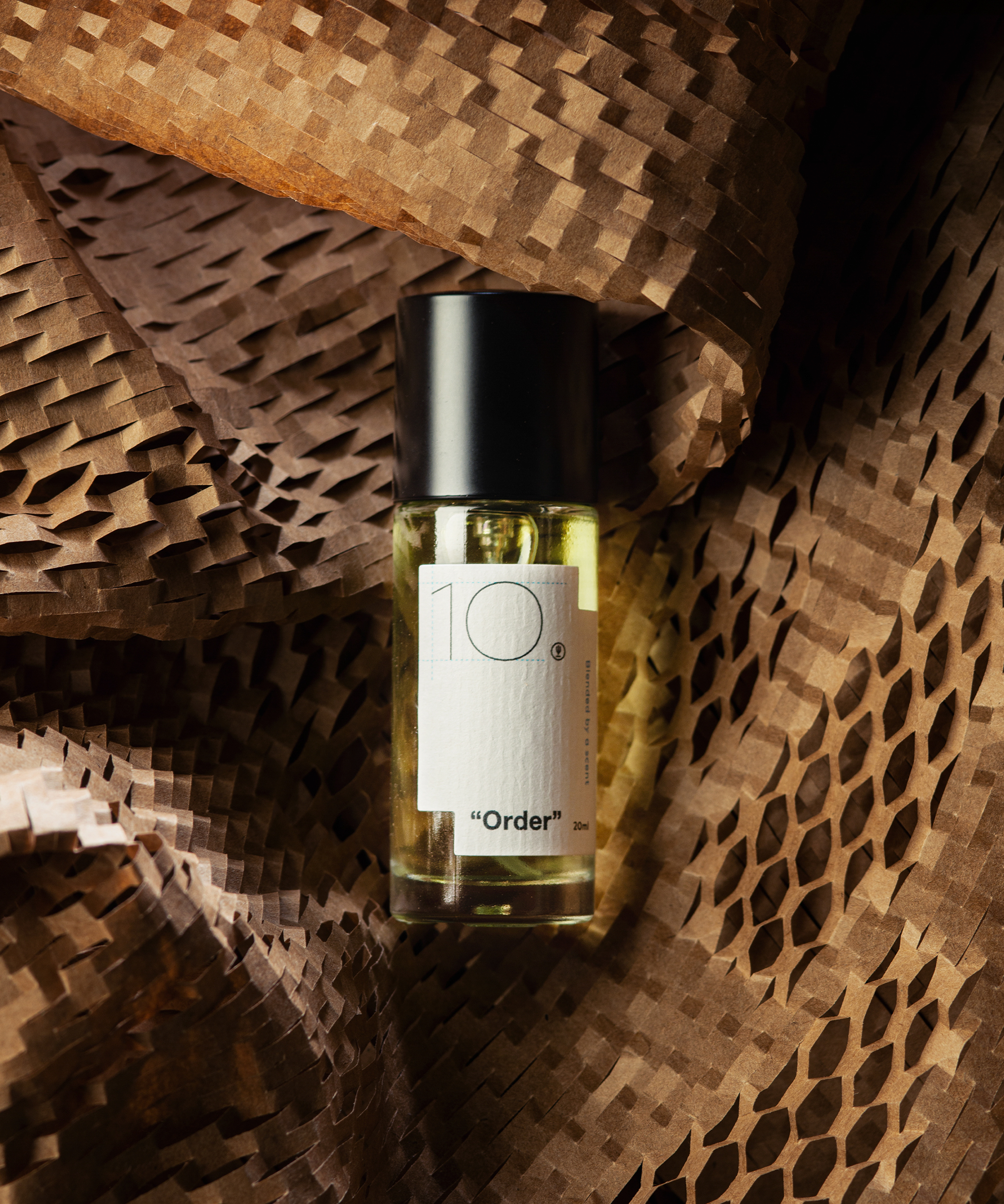
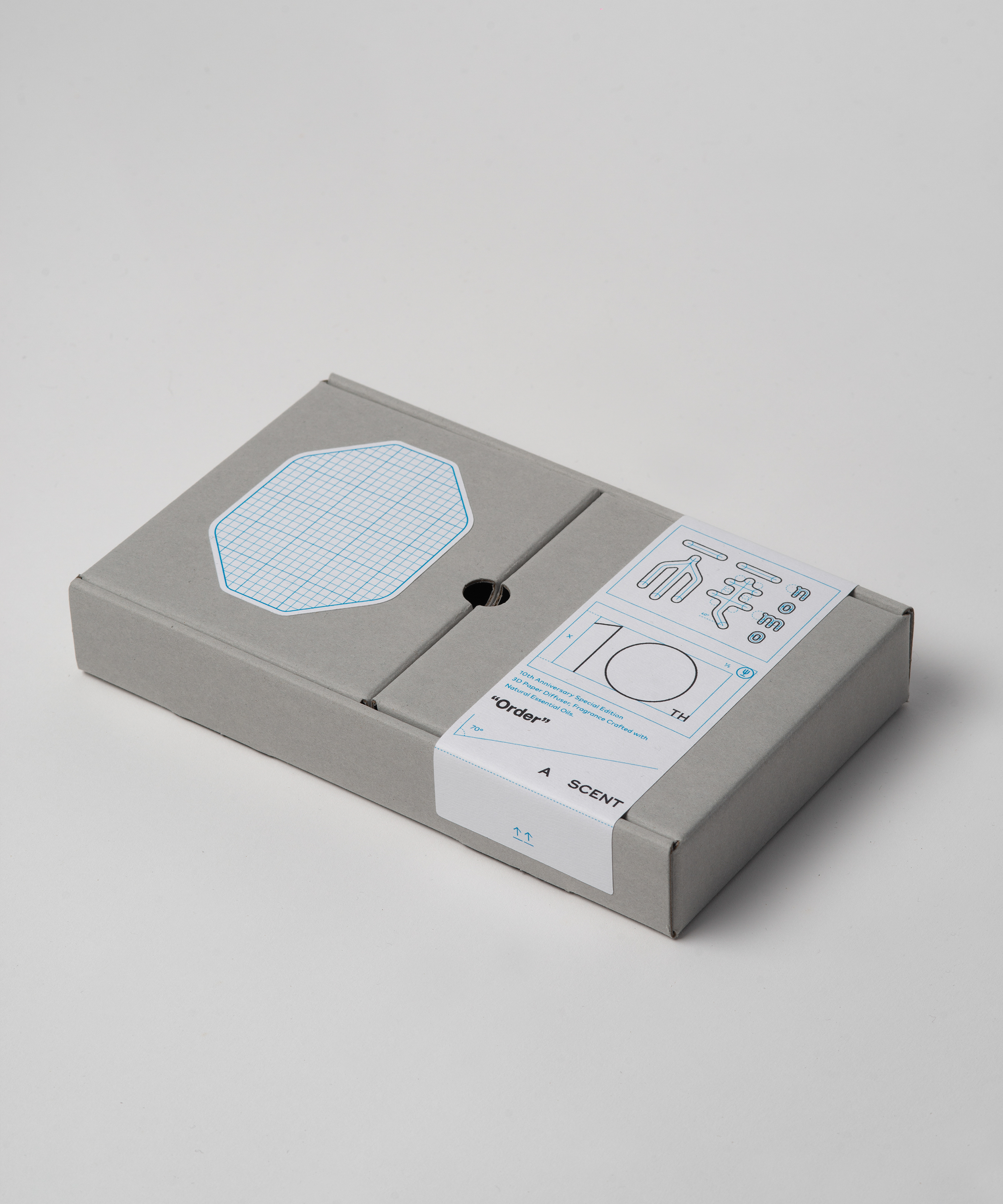
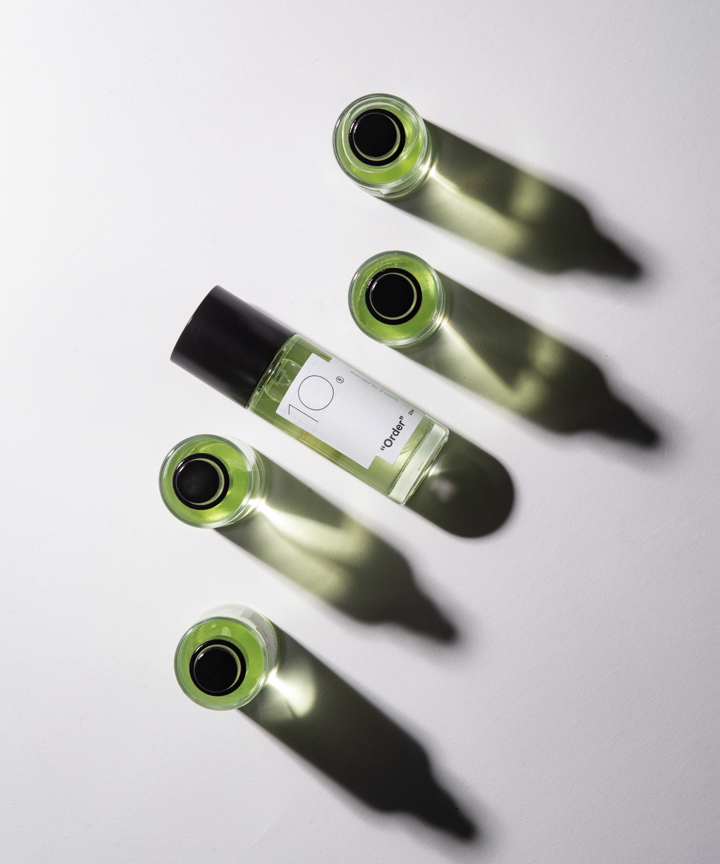
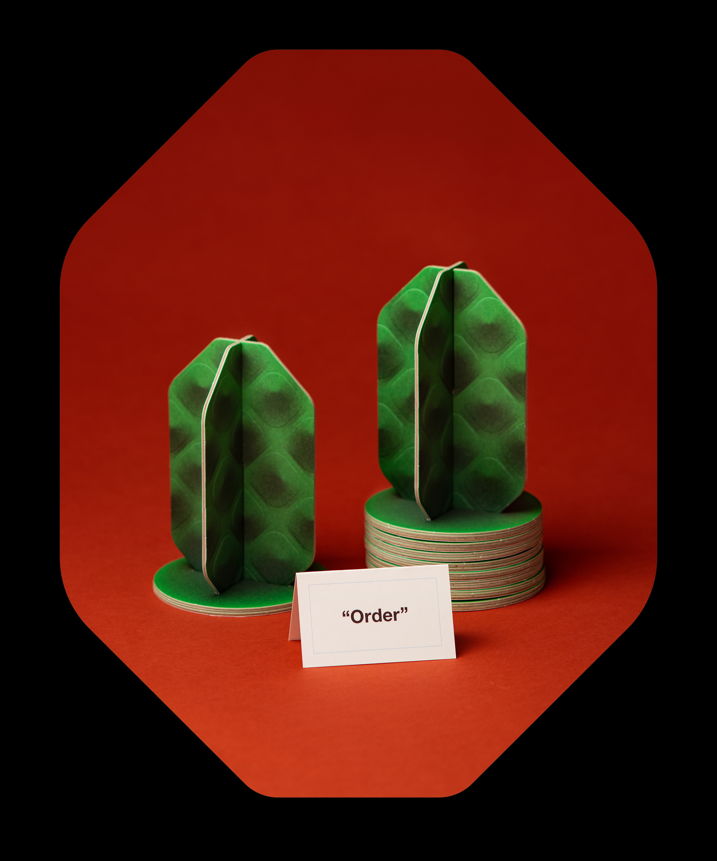
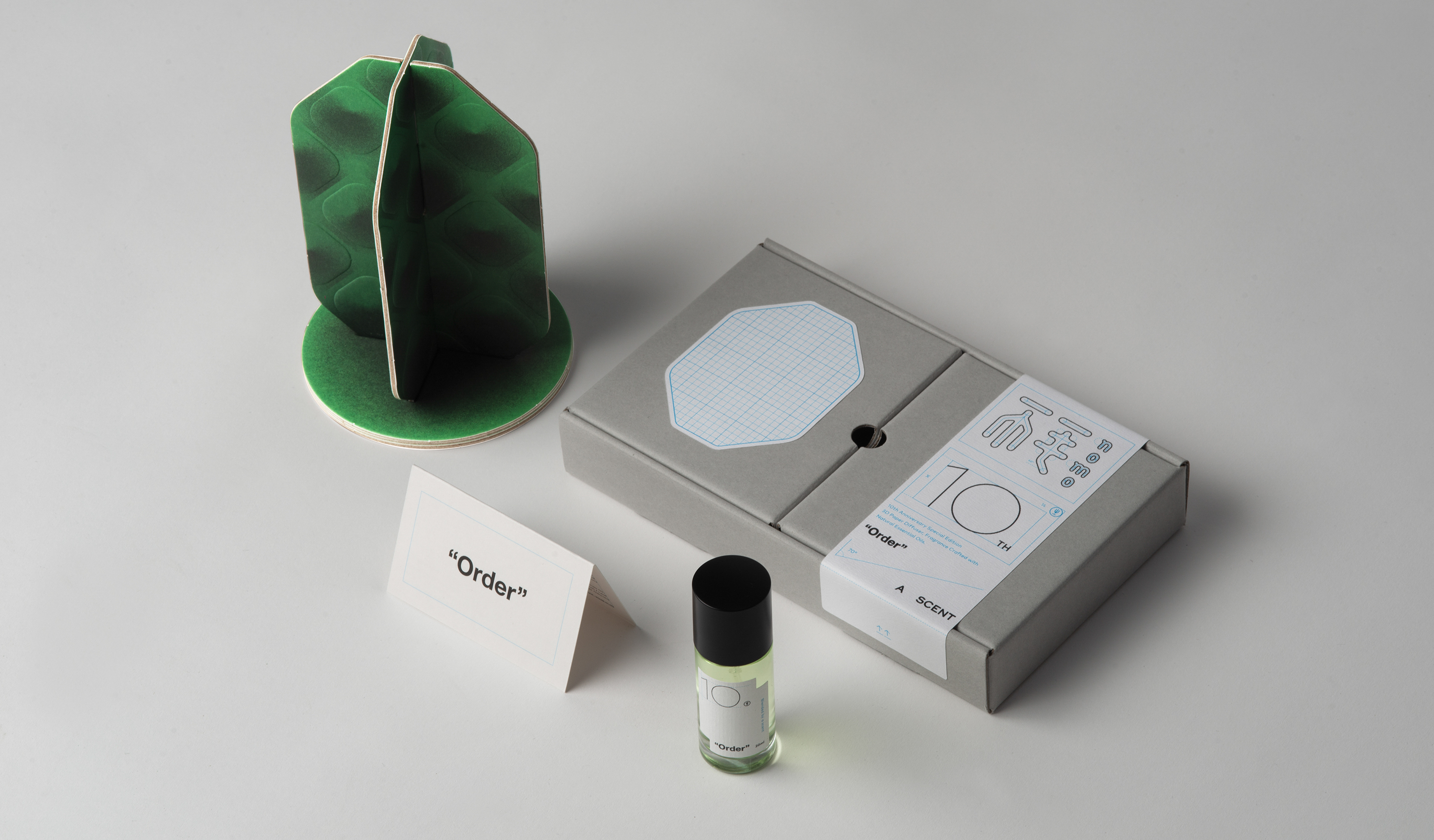
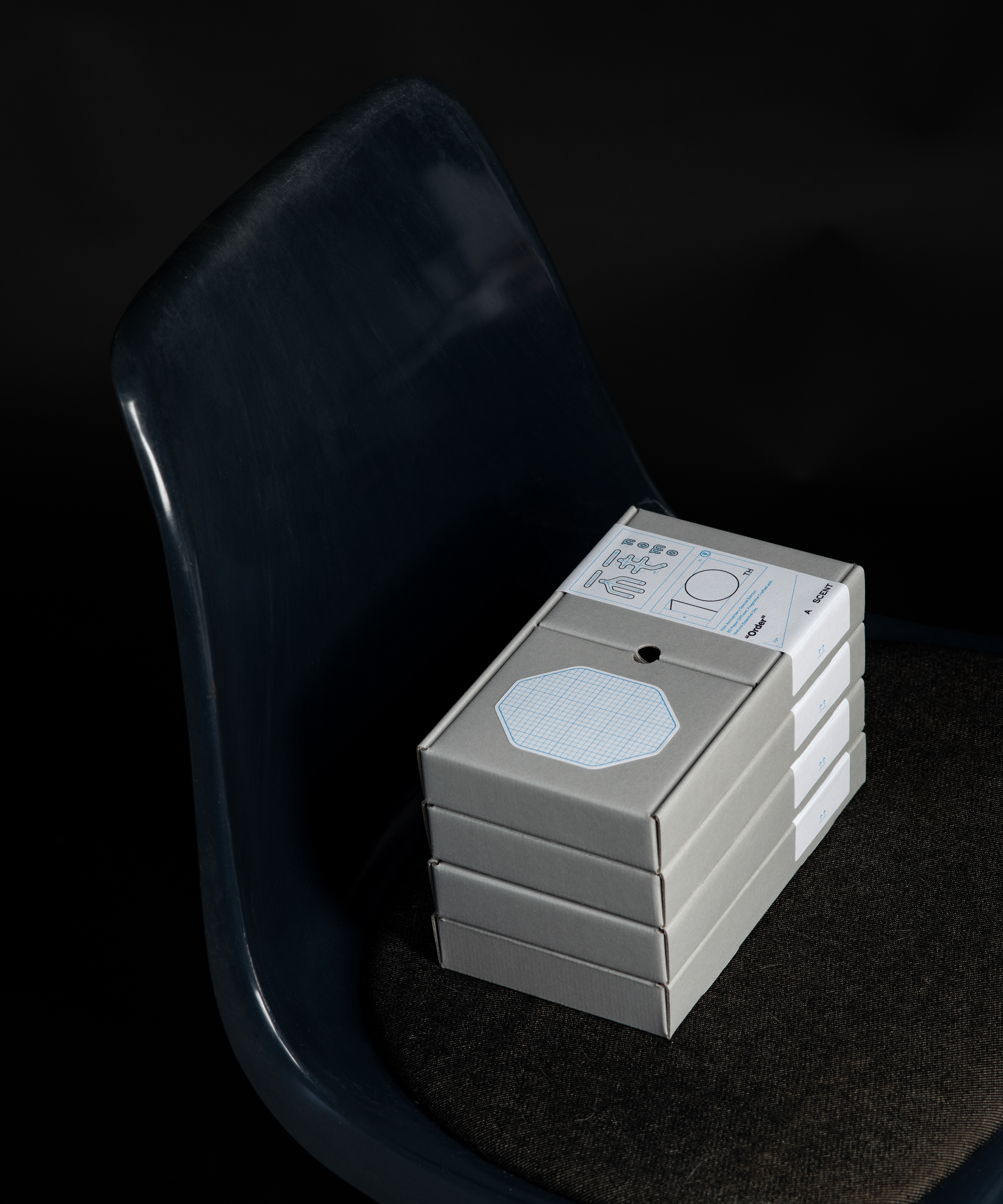
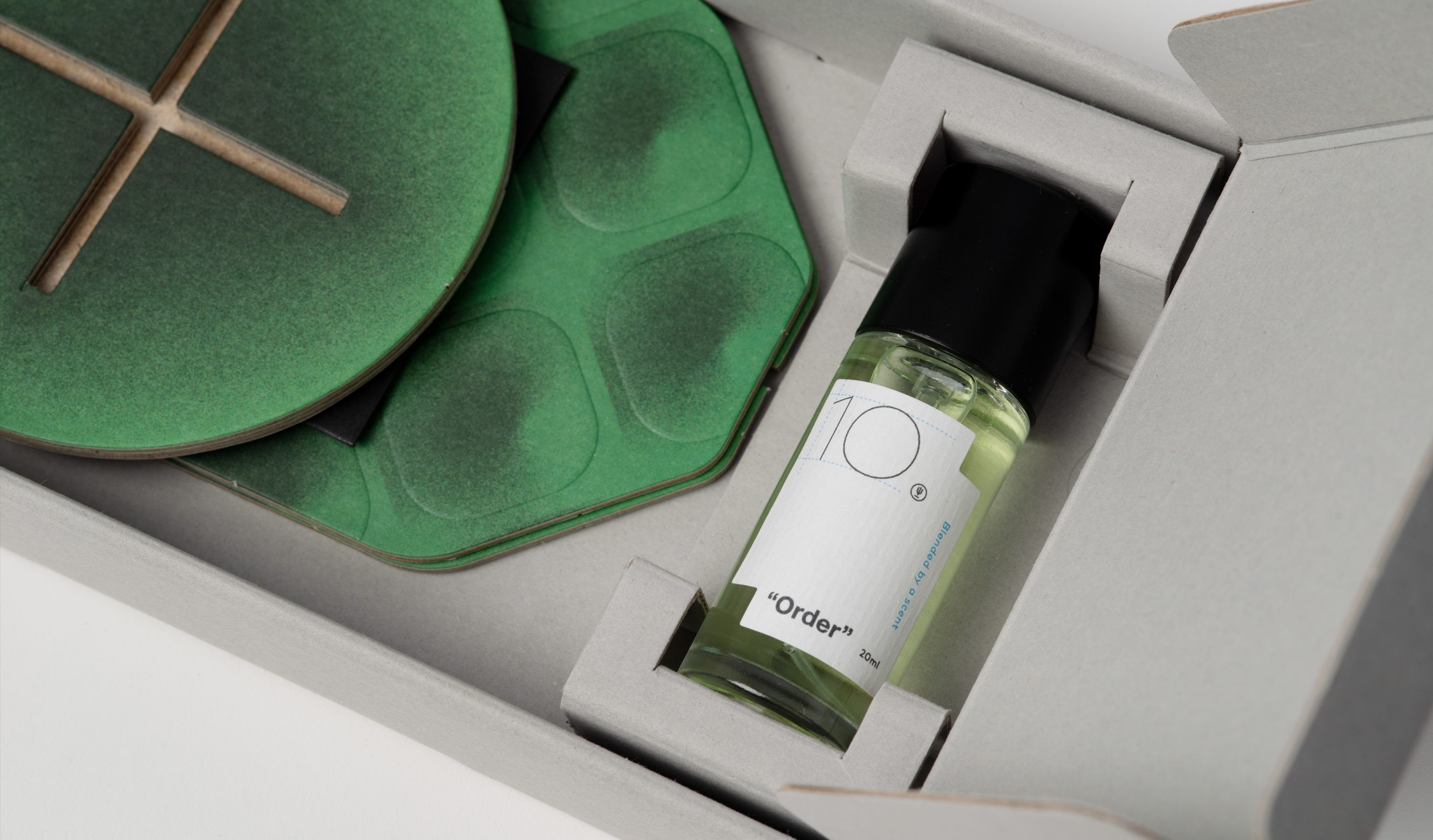
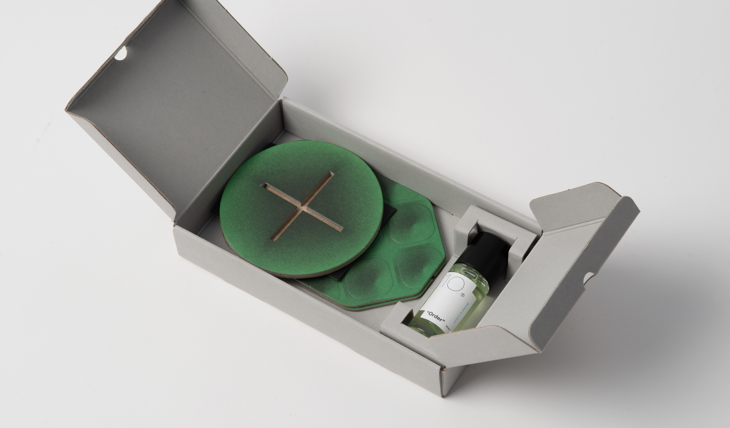
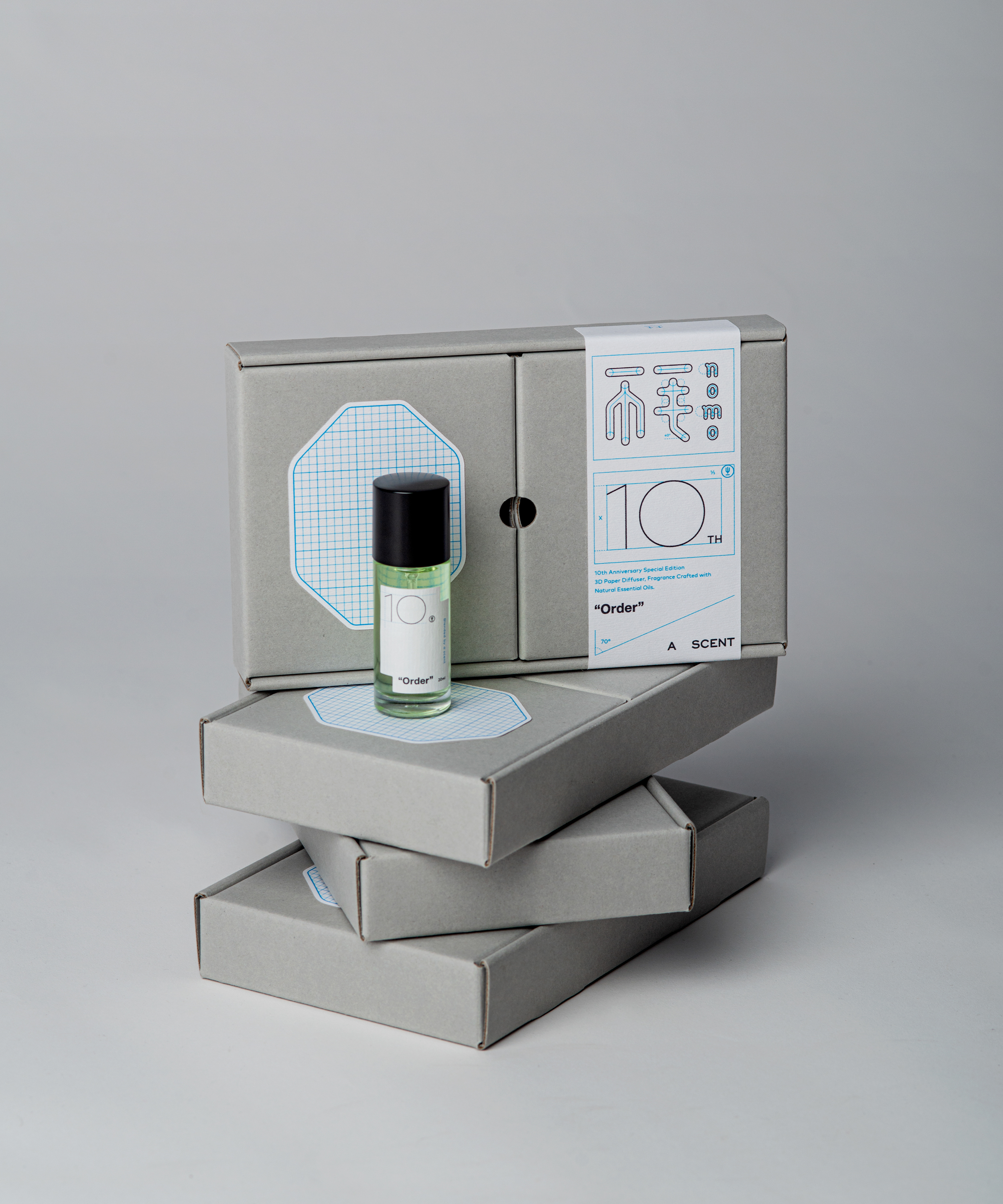
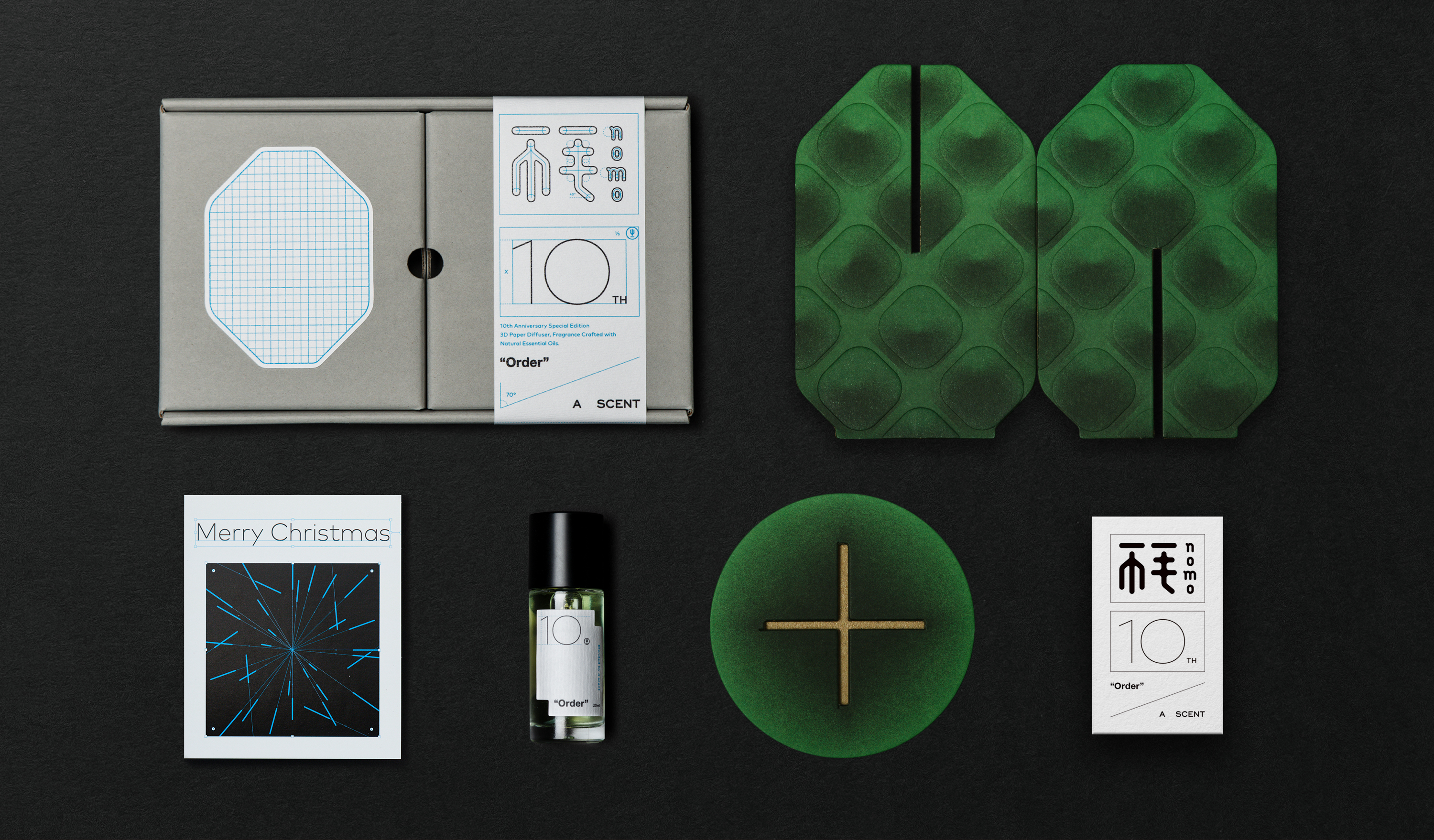
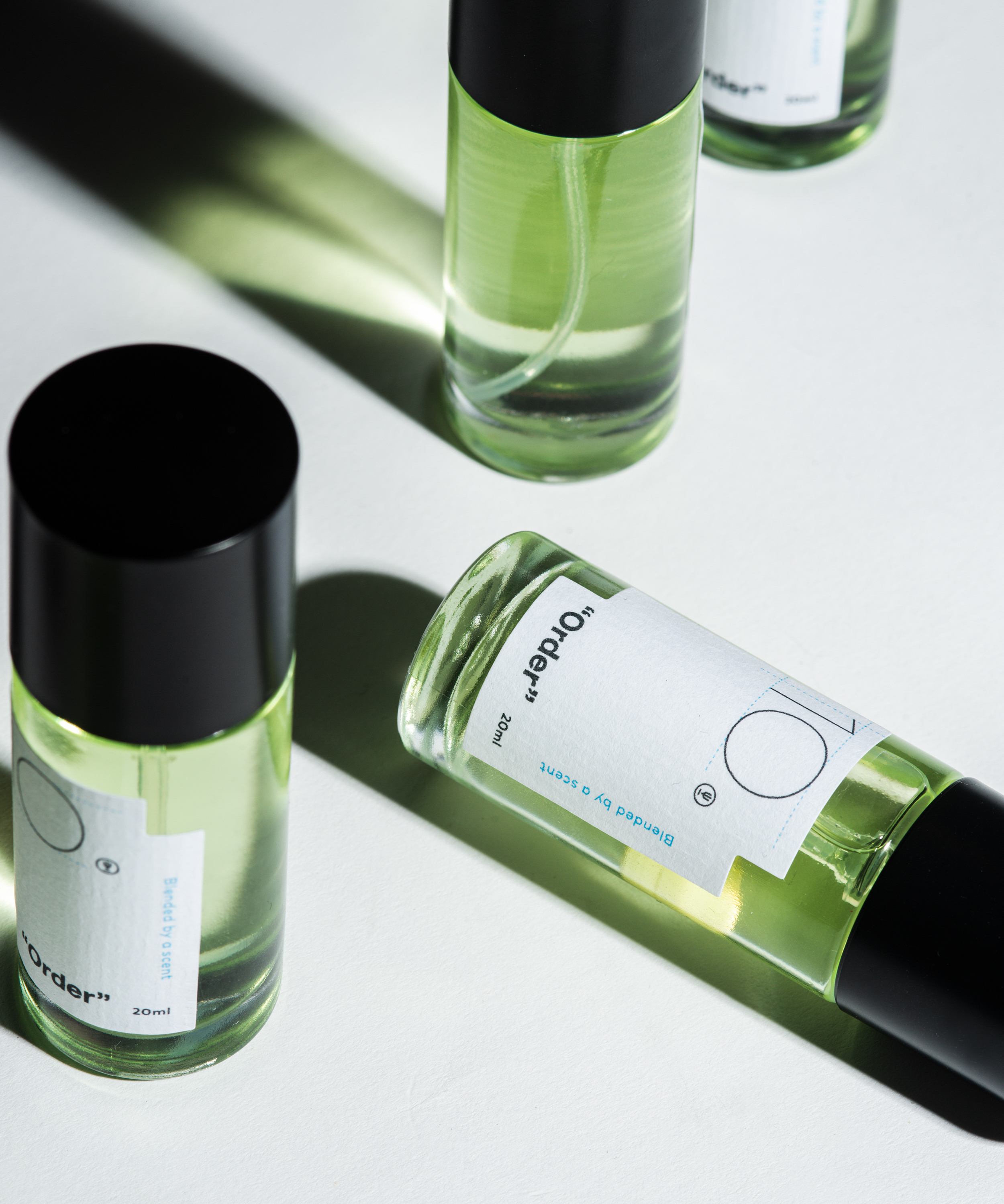
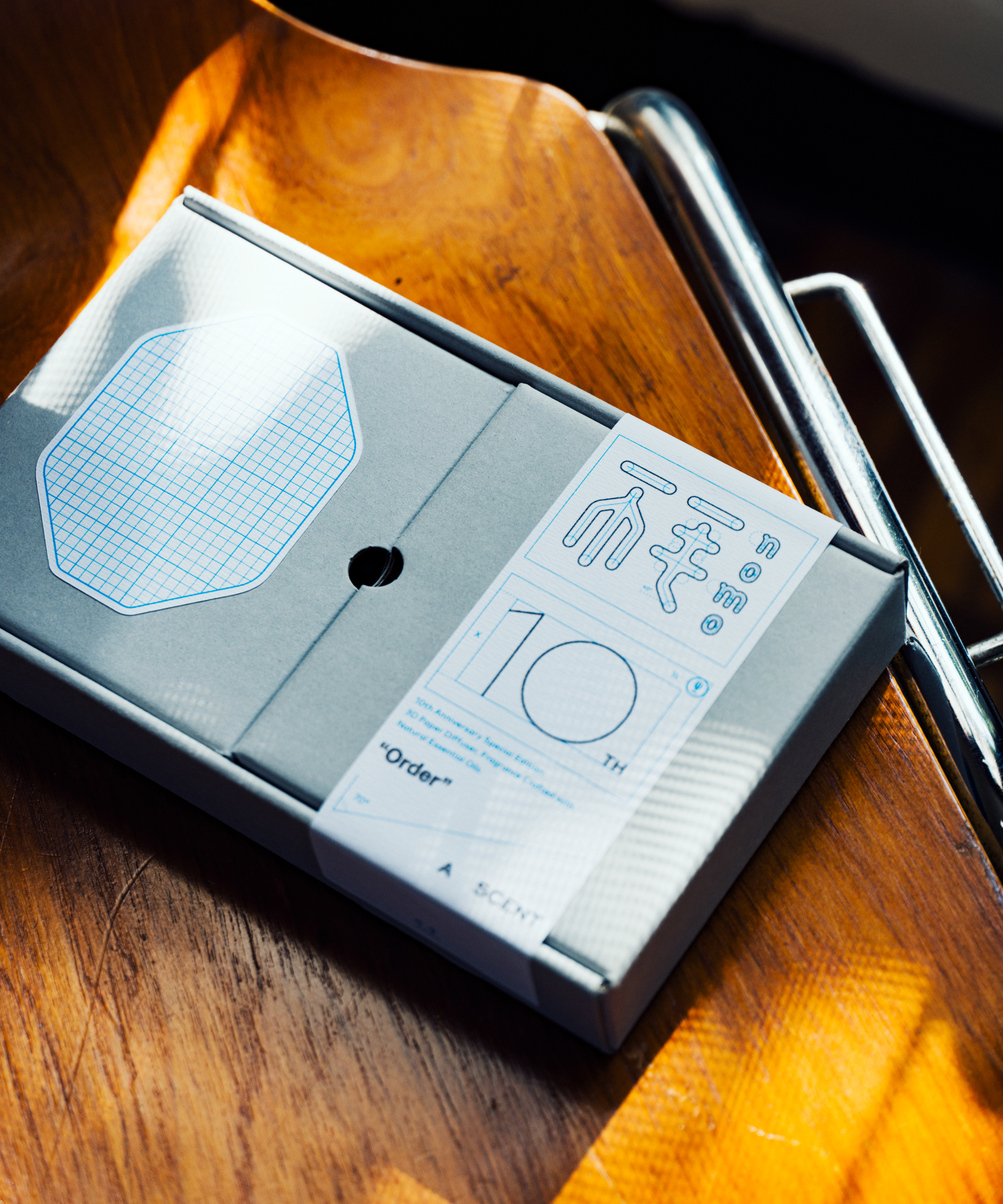
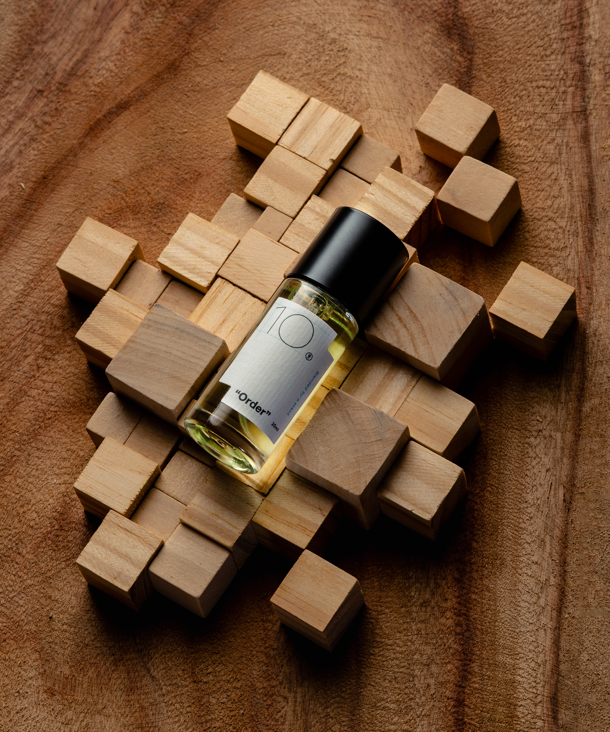
“Order” is a collaborative fragrance created through design and perfumery, conceived as a tenth-anniversary expression of sharing and gratitude. The packaging draws from the designer’s observations of points, lines, and planes, translating identity system drawings and usage guides into a renewed design language that redefines the aesthetics of order.
Invisible geometry underlies material form. Within countless iconic marks lie precise structures—inseparable like flesh and bone—where concept and expression together shape a clear visual blueprint.
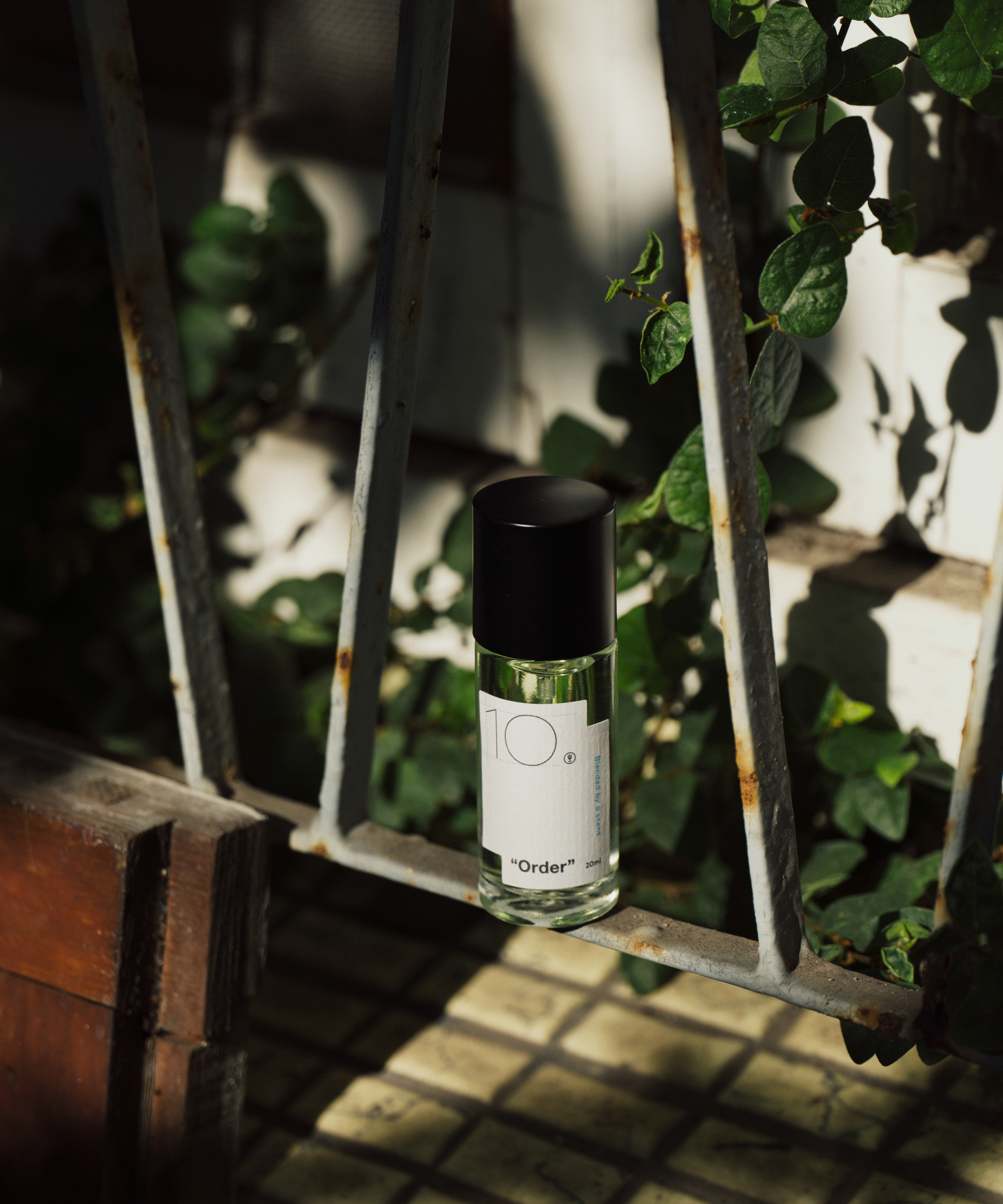
Precise and constant, the fragrance traces the rhythm of everyday life. Lemon and lavandin set a moment of clarity at the opening; ylang ylang and petitgrain establish structure and progression; black spruce and amyris bring the composition to order, refined into a final signature.
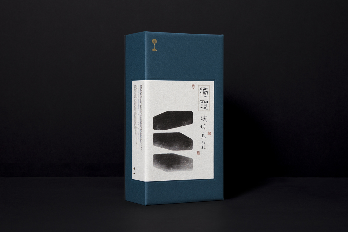
設計與調香共同完成的聯名香氛 ——”Order”,源於分享與感謝的十週年紀念之作。包裝概念擷取設計師日常所見的點、線、面,將識別系統的製圖邏輯與使用指南轉化為設計語言,使熟悉的視覺以另類方式觀看,重新定義秩序美學。
隱形的幾何,物質的構成,無數經典標誌皆蘊藏著精準結構,如同肉與骨,彼此不可分離;概念與表現彼此相互成就,構築清晰有序的視覺藍圖。
精準、恆定,以香氣描繪生活軌跡與藍圖。檸檬與醒目薰衣草是靈光乍現,勾勒起始節奏。伊蘭與苦橙葉排列邏輯與結構,推敲循序軌跡。黑雲杉與阿米香樹收齊秩序,反覆淬煉之落款。
T Fragrance Creation, Packaging Y 2025 AD Yu Chien Lin D Yu Chien Lin, Chi Tai Lin PH Huang Jun Tuan

Related Projects
![]()
![]()
![]()


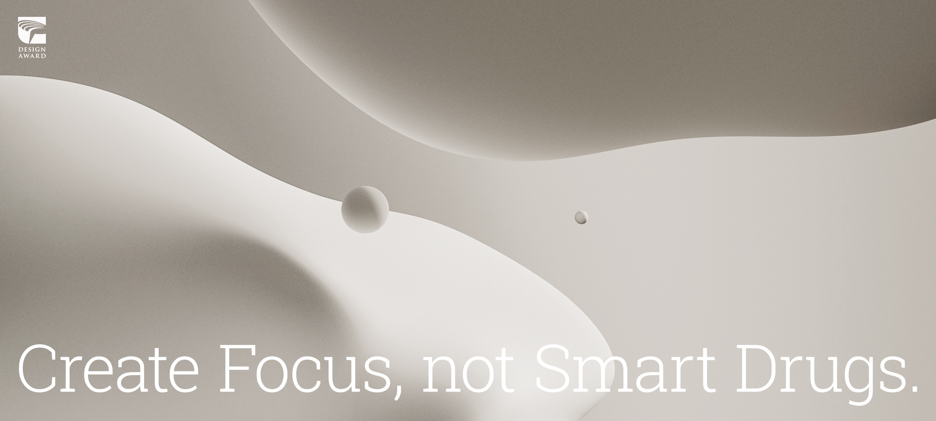
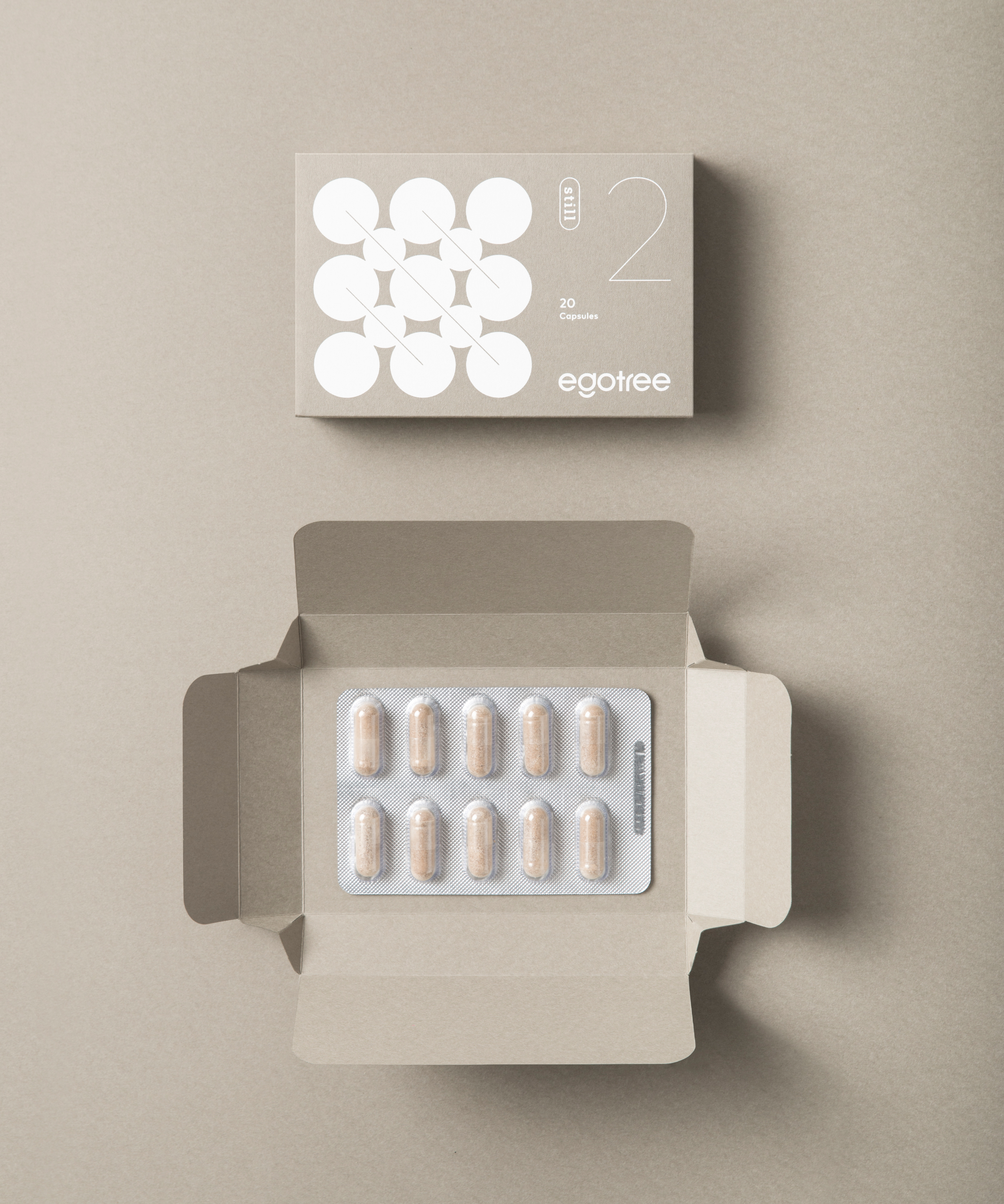
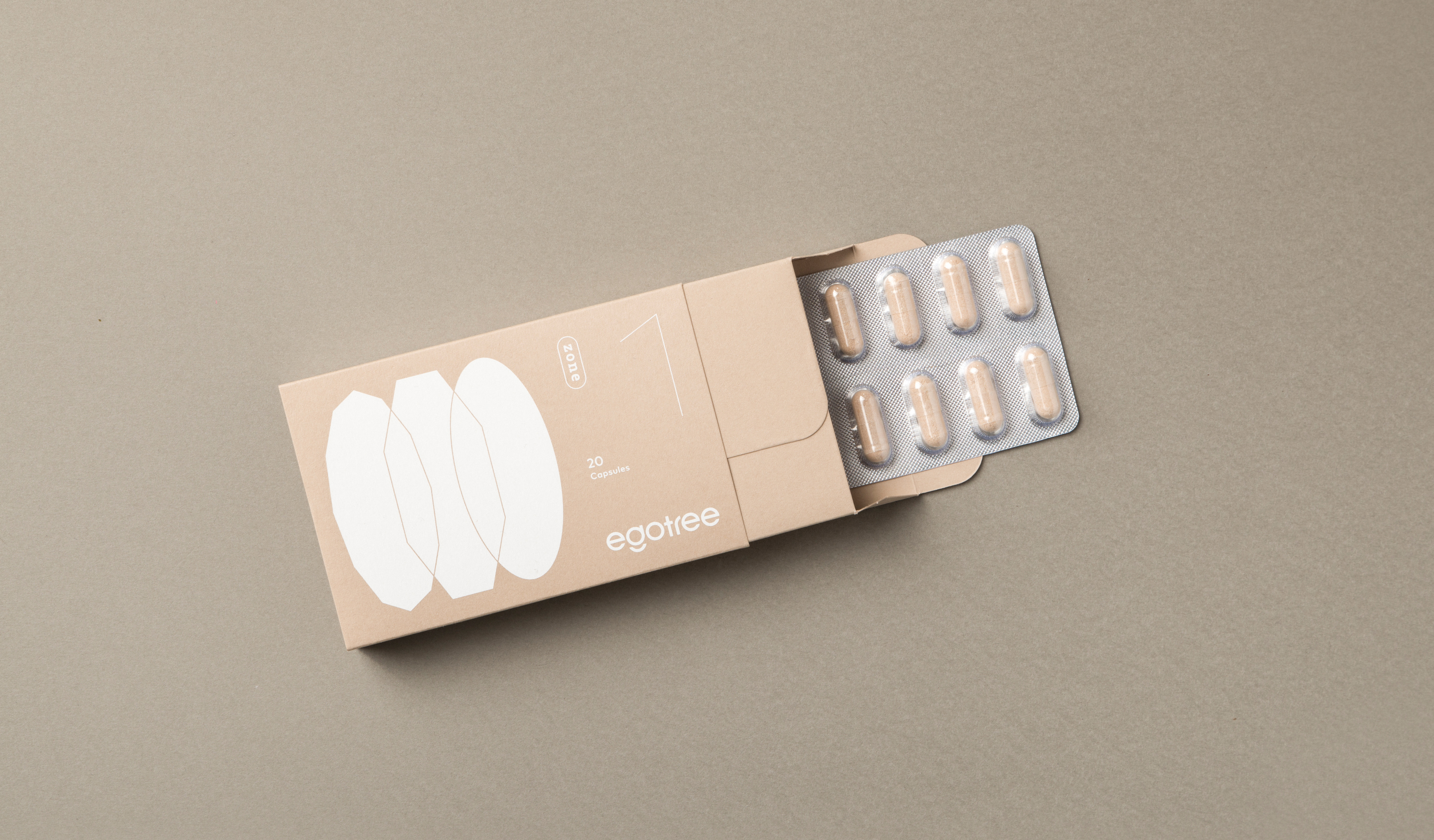
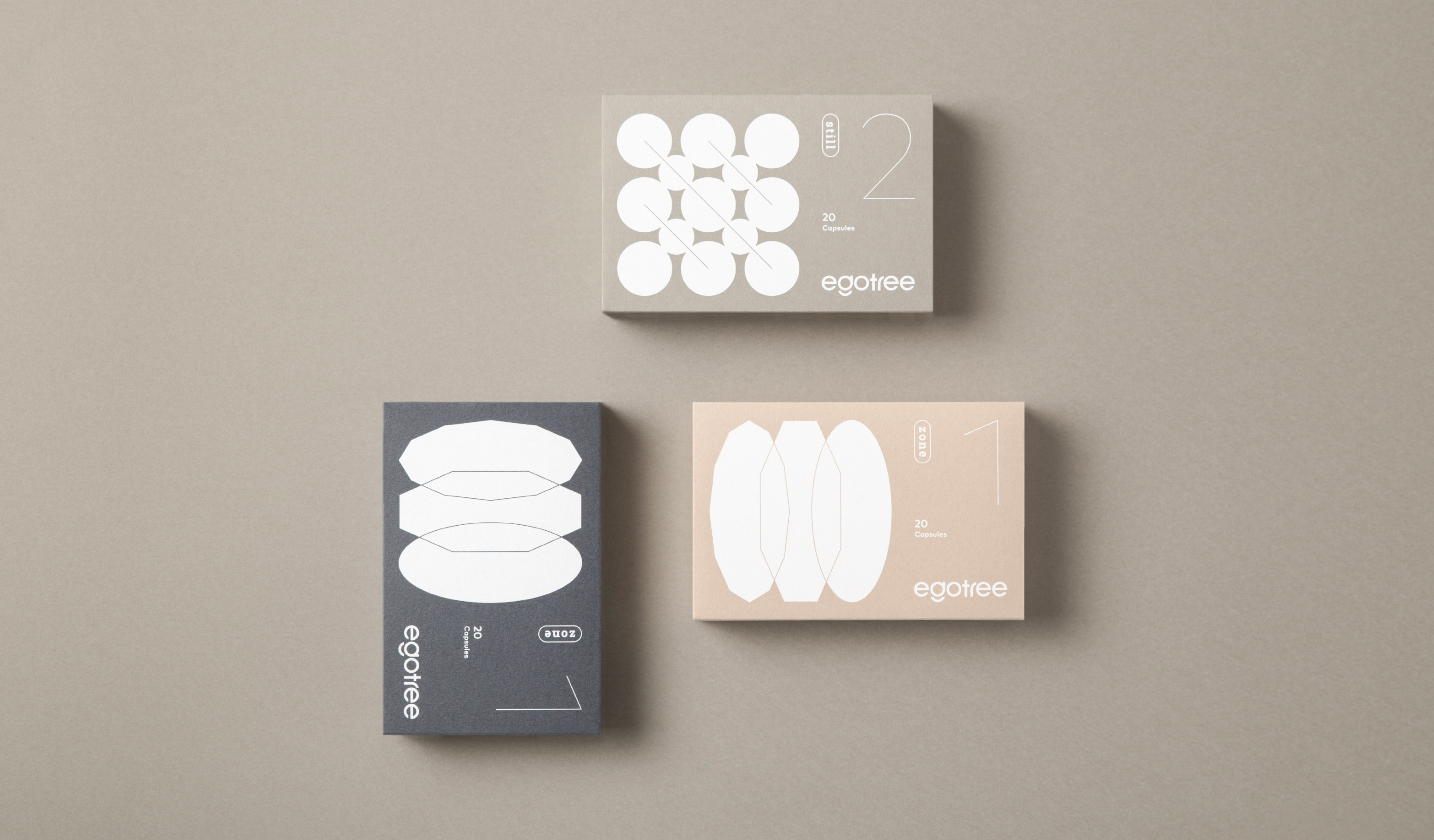
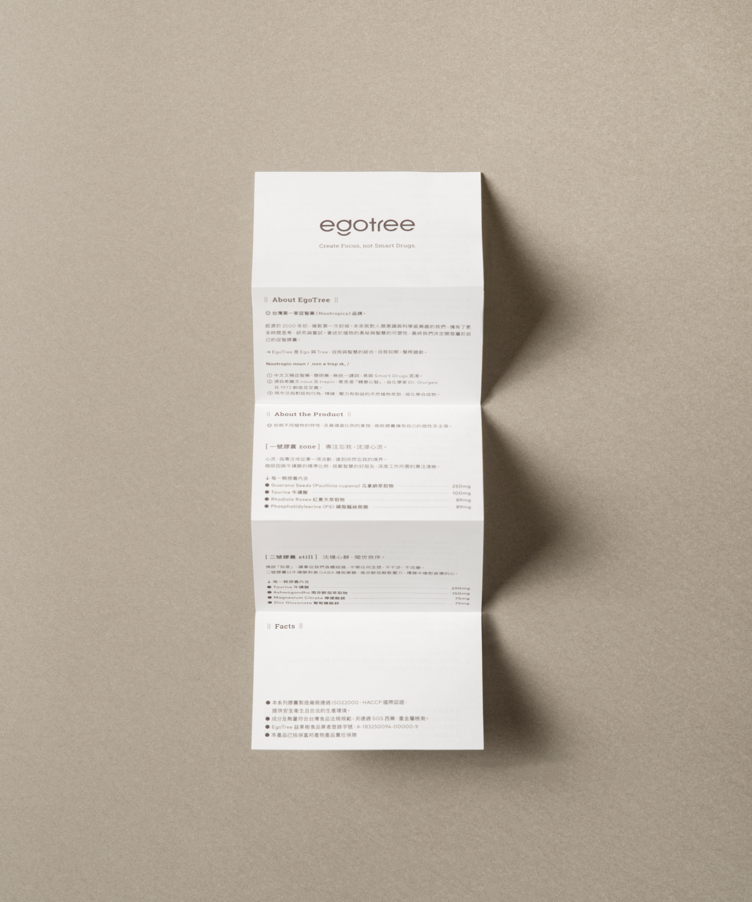
The very first nootropic dietary supplement Taiwan company, egotree began in 2020, which has the highest interest in human consciousness and the science of neuroscience and obsesses about the malleability of the brain, has developed the nootropic made-by nature planet extraction. With the sense of mission to promote the nutrition of the brain, Egotree has dedicated to be the pilot of the brain workers.
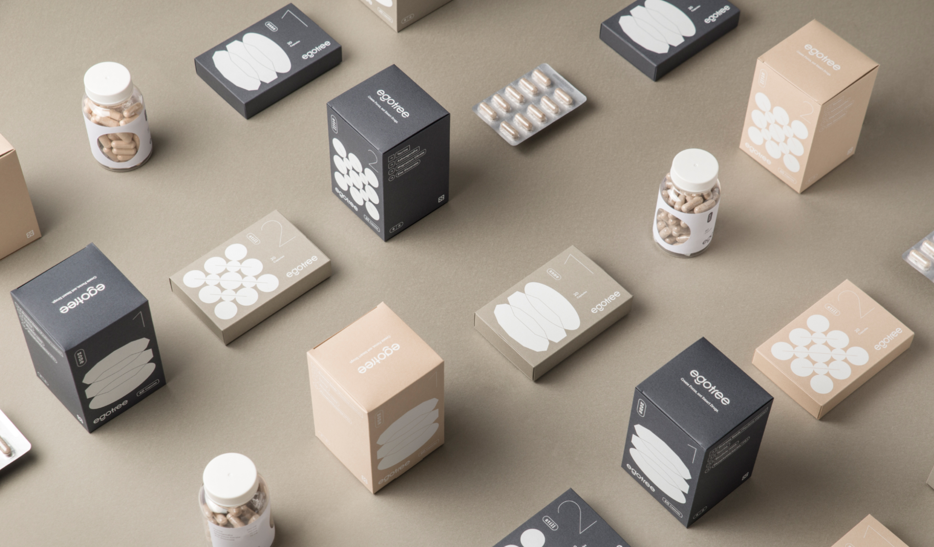
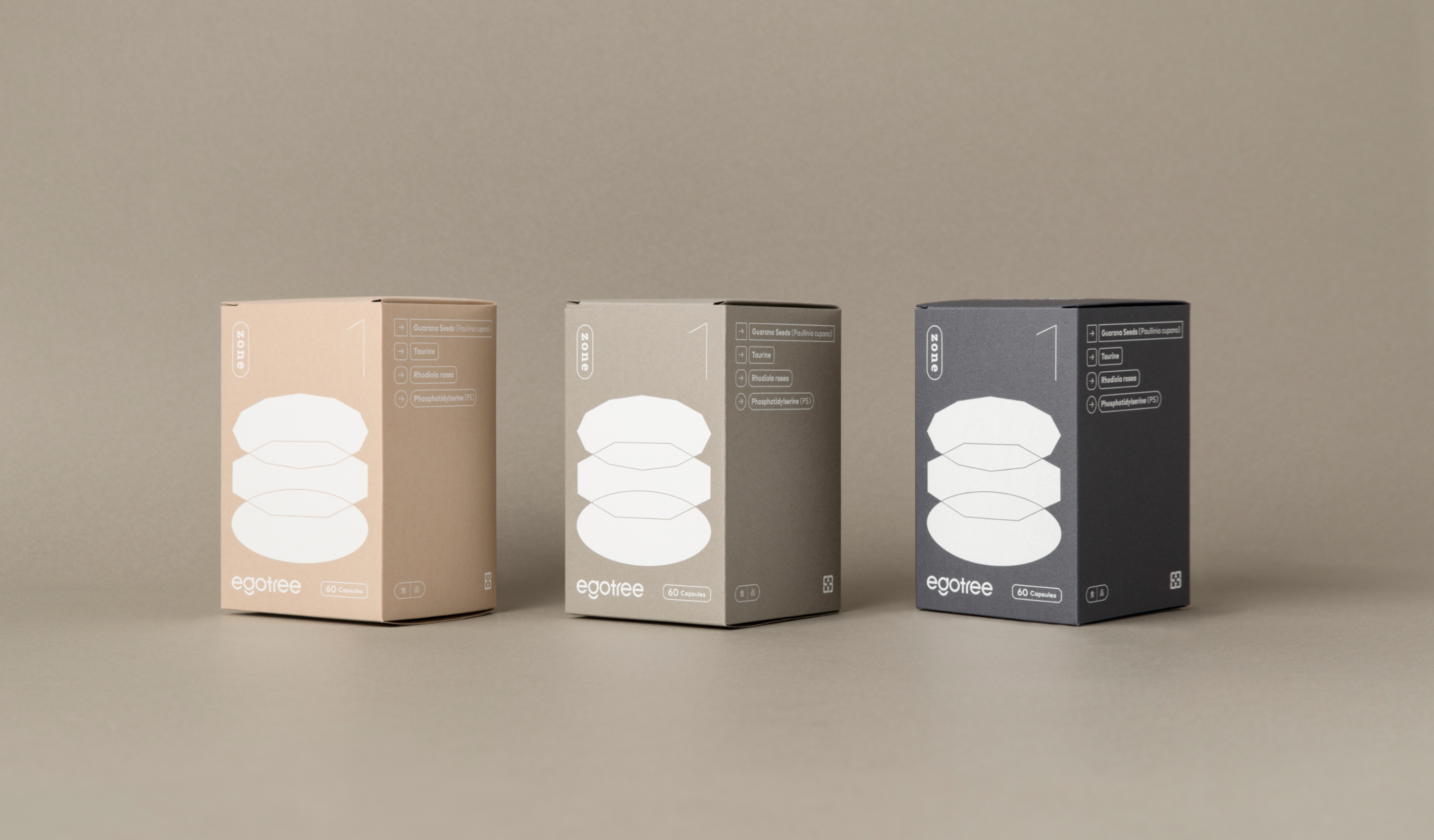
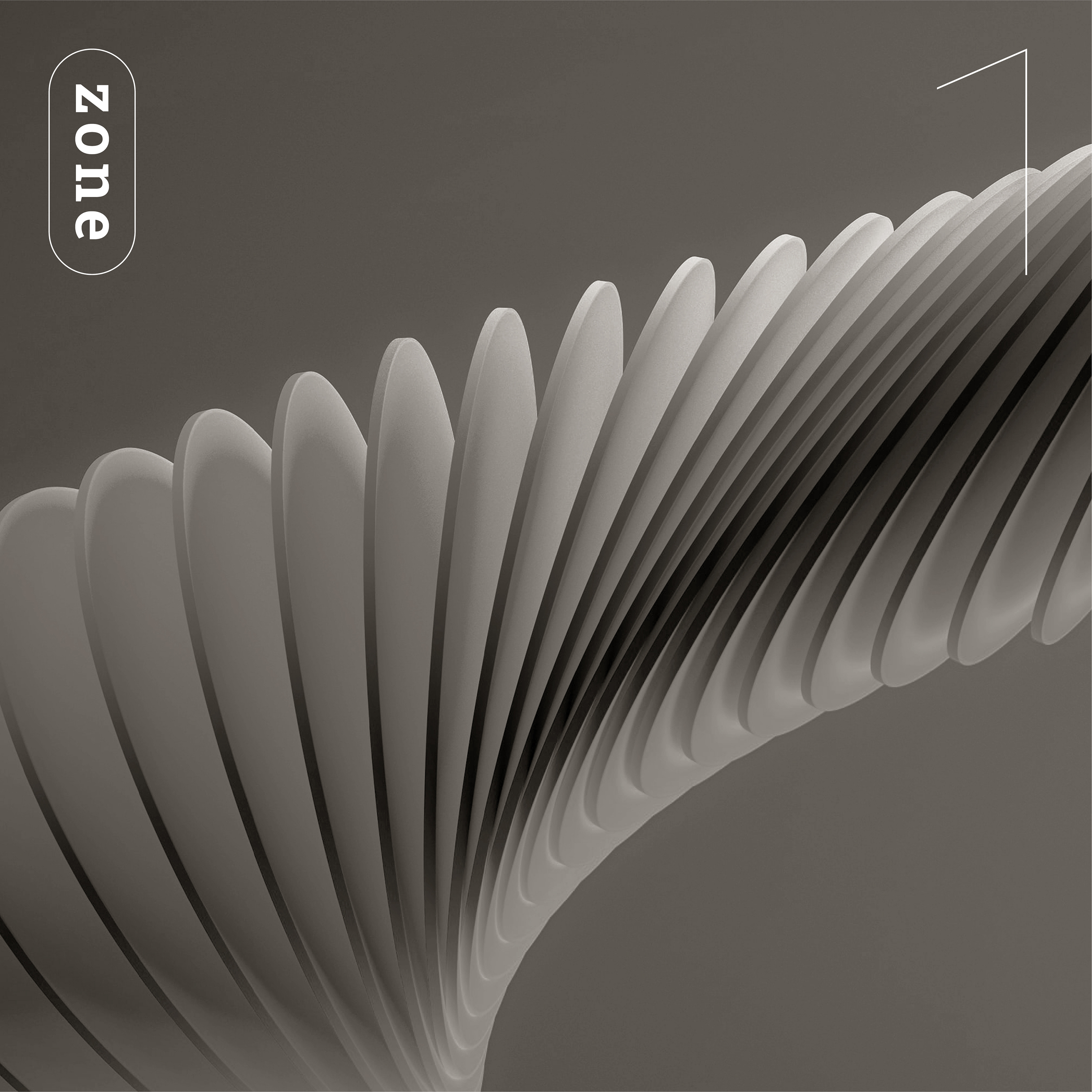
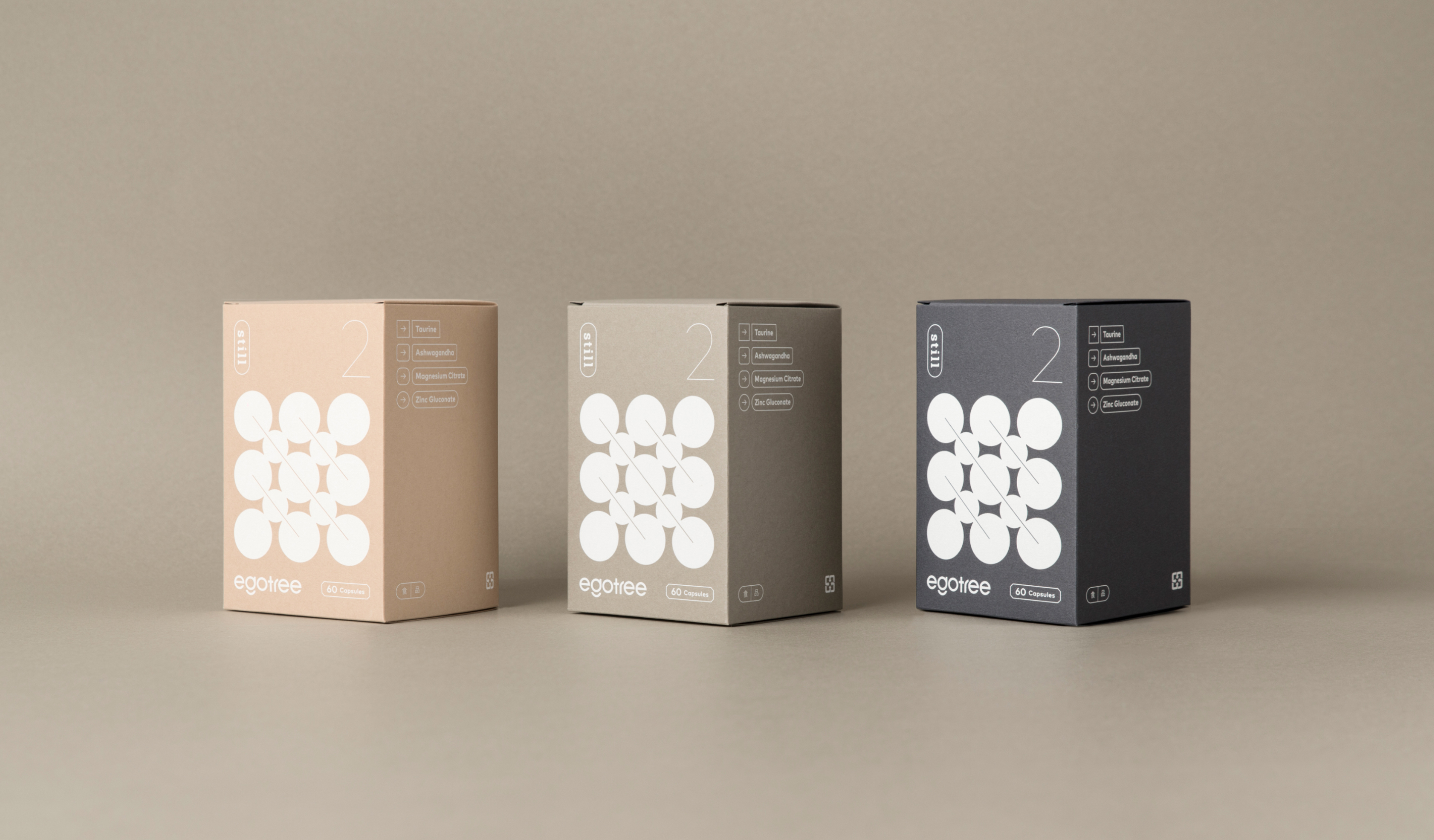
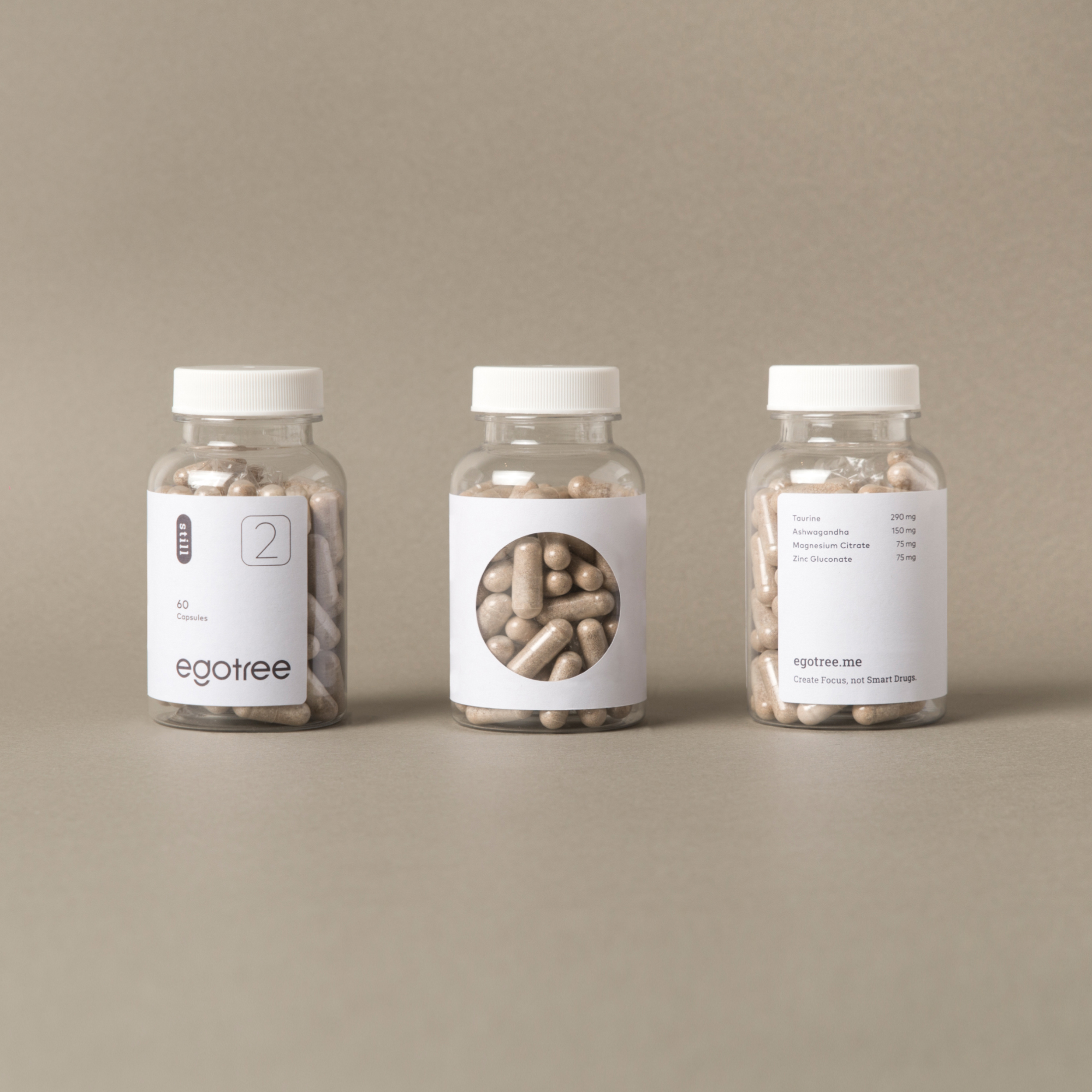
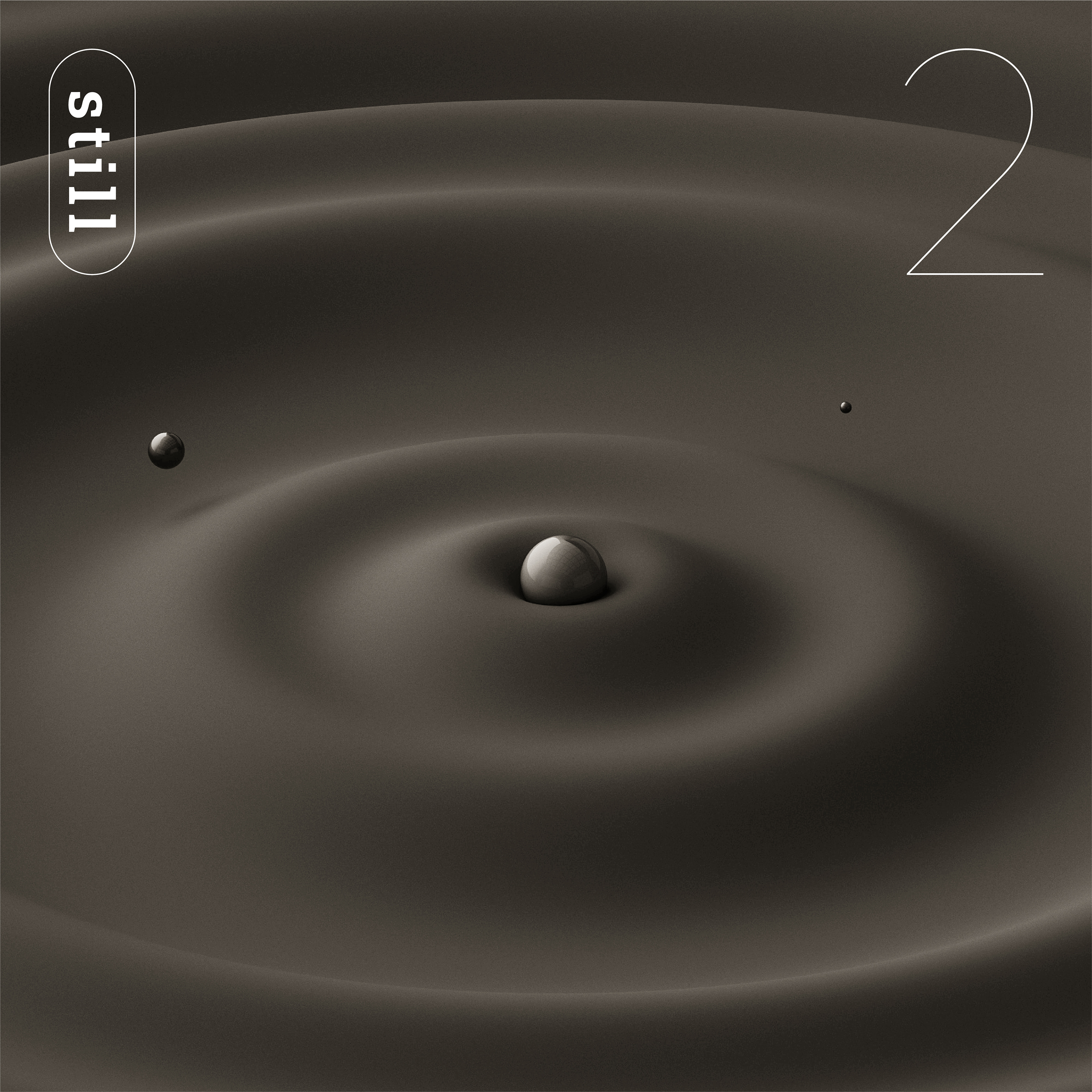
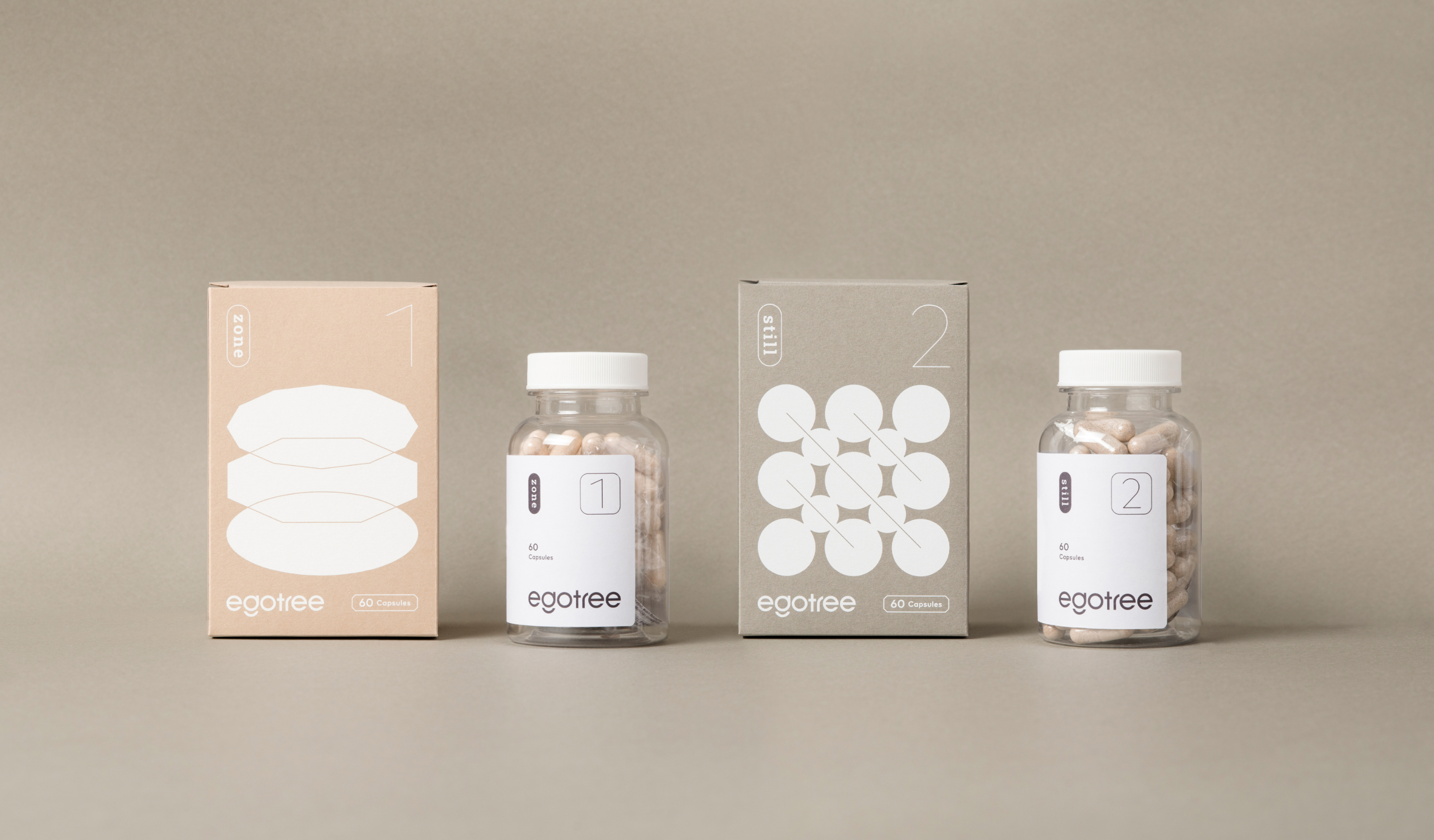
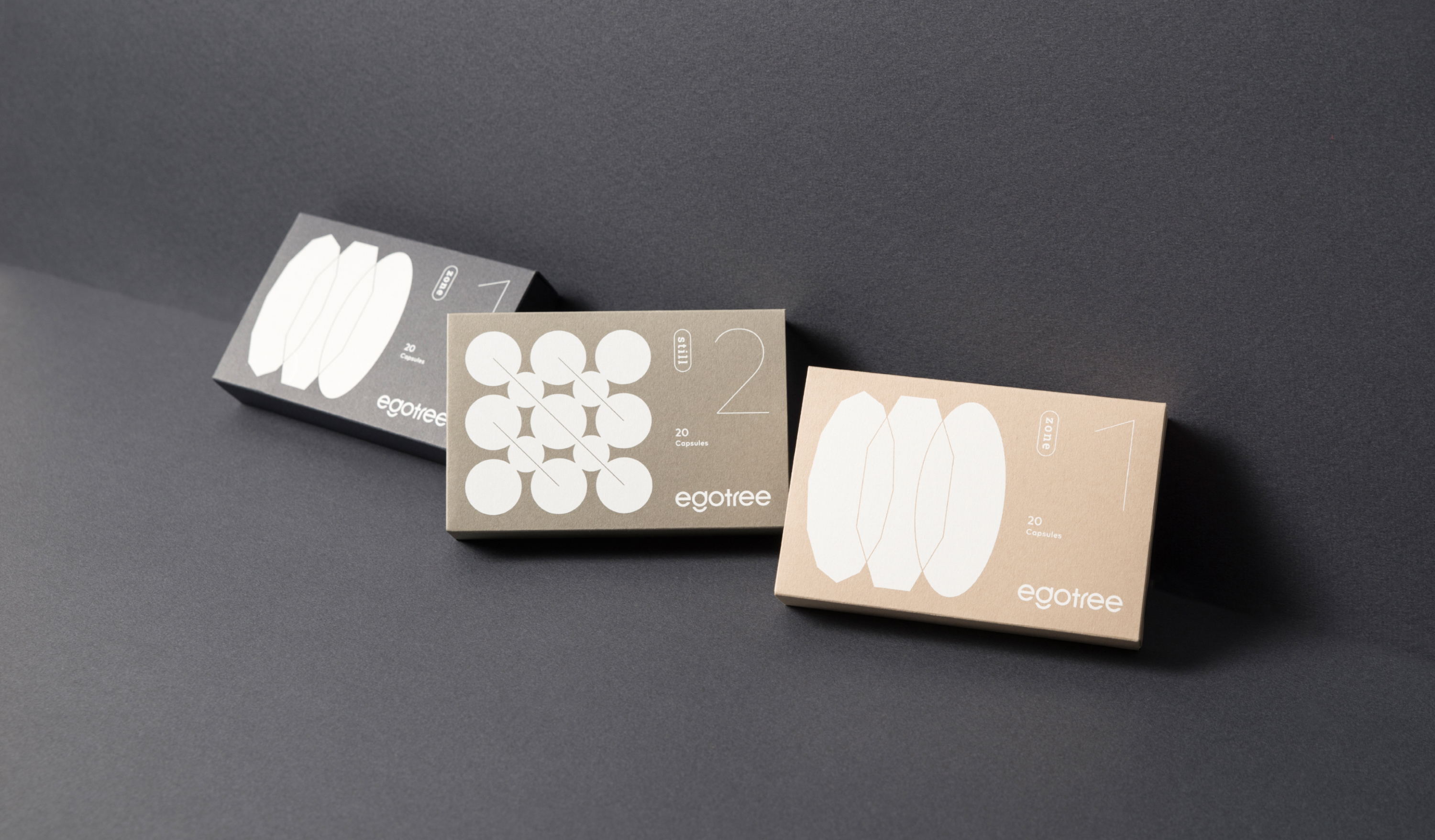
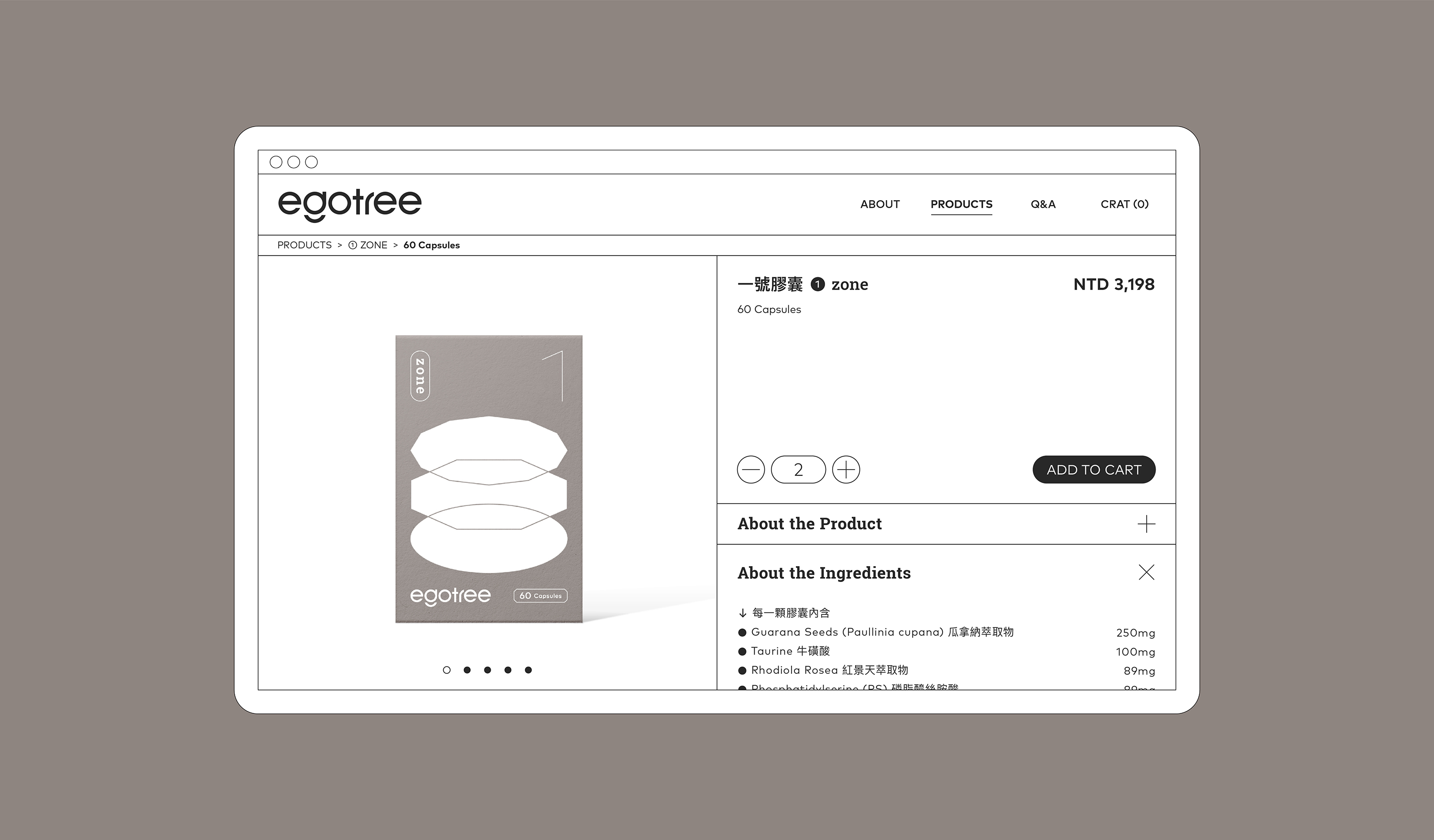
The combination of the ego and tree in brand identity, started from the exercise of spherical energy body. By capturing the process of brain, transferring the floating, the bumping, the gathering and dispersing of energy into a symbol, and further extending the concept of the package. Constructing the unique graphics of capsule, one (zone) and two (still), in addition to conveying the abstract experience of the product.
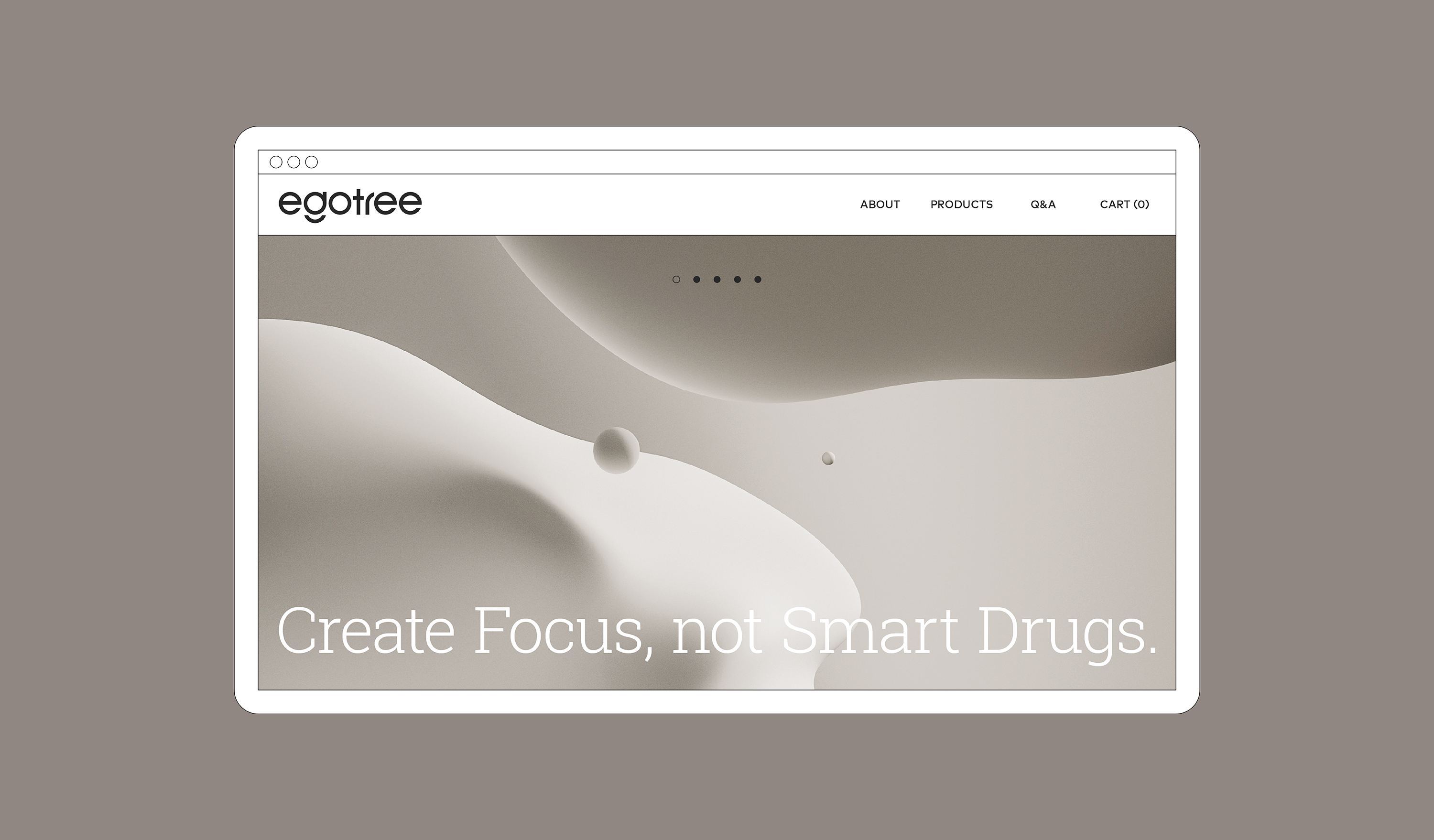
In order to divide the stereotype that marketing of dietary supplement usually emphasis the ingredient and the effect, by using the abstract visual with the warm tones color system to build up the image of the brand, connecting Egotree's brand definition " start from people " and the idea of bring the revolutionary experience to the consumer.
台灣首創促智 (Nootropics) 保健品牌 益果樹 egotree 起源於 2020 年,本著對人類意識與腦神經科學的高度興趣,以及對植物奧秘與大腦可塑性的著迷,開發出天然植物萃取的促智膠囊,帶著推廣腦部營養促進運動的使命感,專注成為腦力工作者們的領航員。
象徵自我意識 (ego) 與智慧 (tree) 結合的品牌意涵,以球型能量體的運動作為識別概念出發,捕捉腦部運動過程的能量流動、碰撞、聚散等狀態轉化為標誌視覺意象,並將概念延伸串聯產品形象包裝,塑造一號膠囊 (心流 zone) 與二號膠囊 (沈浸 still) 的專屬視覺圖形,藉此傳遞產品使用功效的抽象體驗。
為區隔保健食品市場普遍給人強調產品成分和功效的刻板印象,在產品包裝及網站視覺規劃中特意以抽象視覺搭配暖色調的色彩系統塑造品牌形象,連結 egotree 以人本為出發的品牌定位與期望帶給受眾創新體驗的品牌使命。
T Branding, Packaging Y 2021 CD Chi Tai Lin AD Yu Chien Lin D Yu Chien Lin, Chi Tai Lin, Wei Yun Kan, Allison Hsiao PM Yu Chien Lin P Wei Yang Print Plan Agent PH Wei Yun Kan (Packaging) MG Ruopu Li (Logo) C egotree


Related Projects
![]()
![]()
![]()
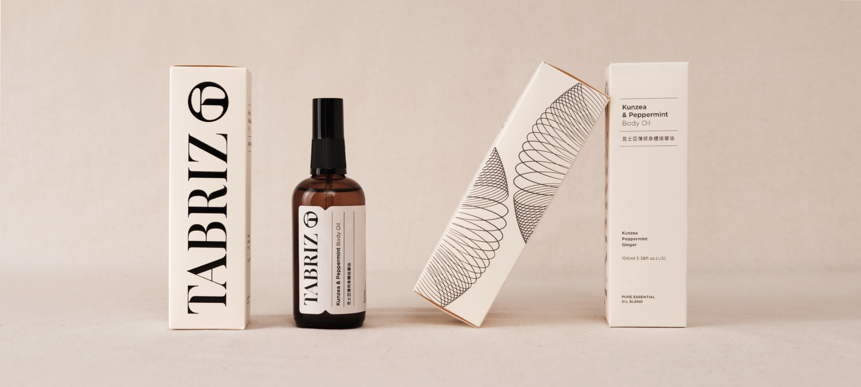
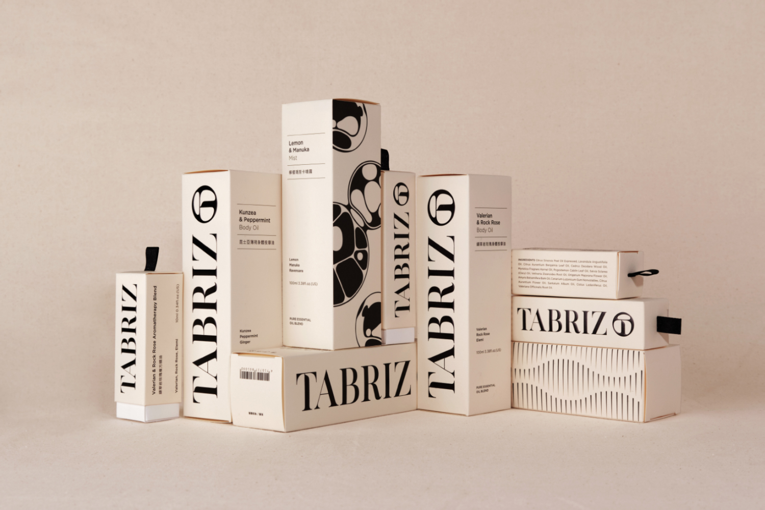
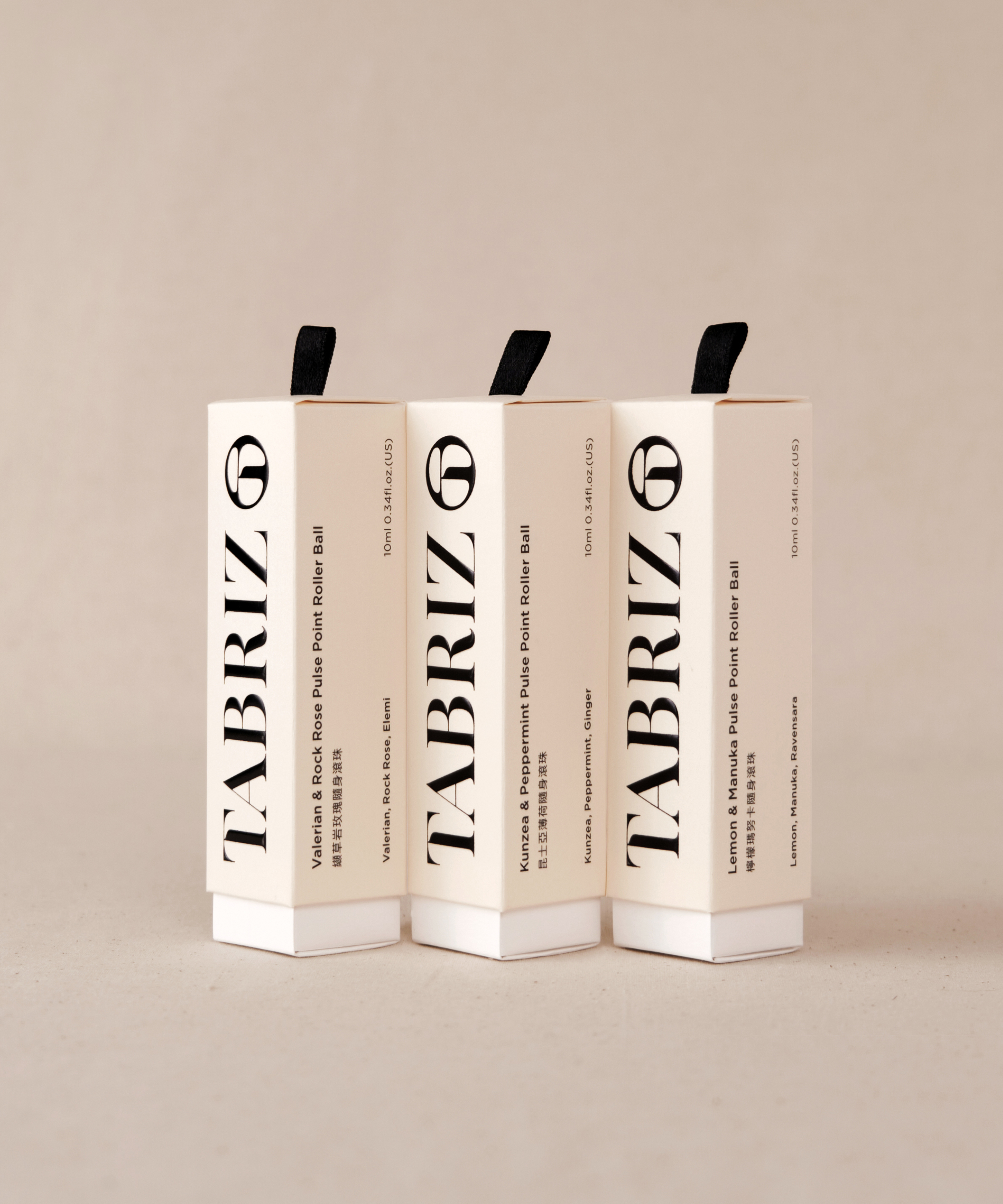
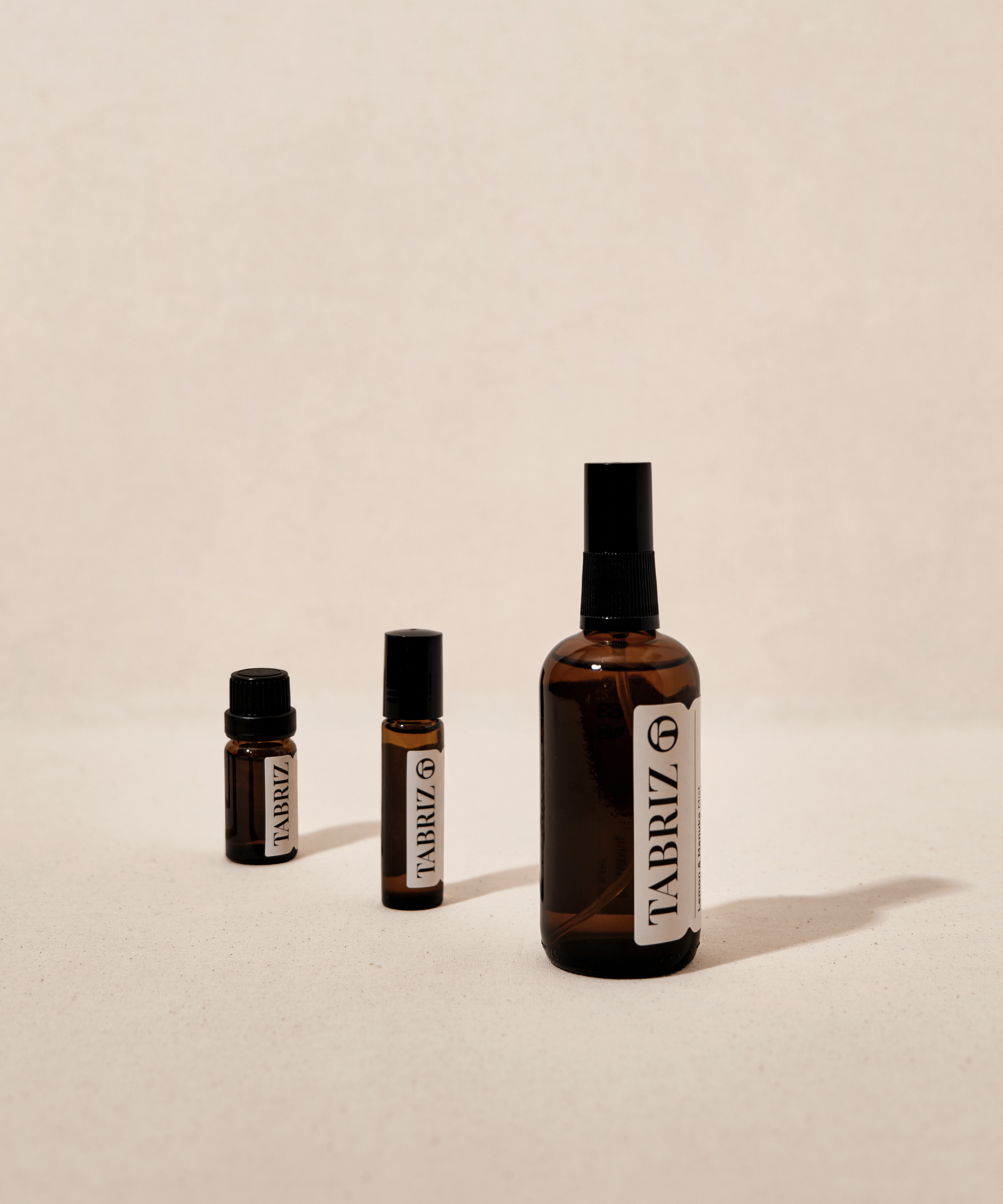
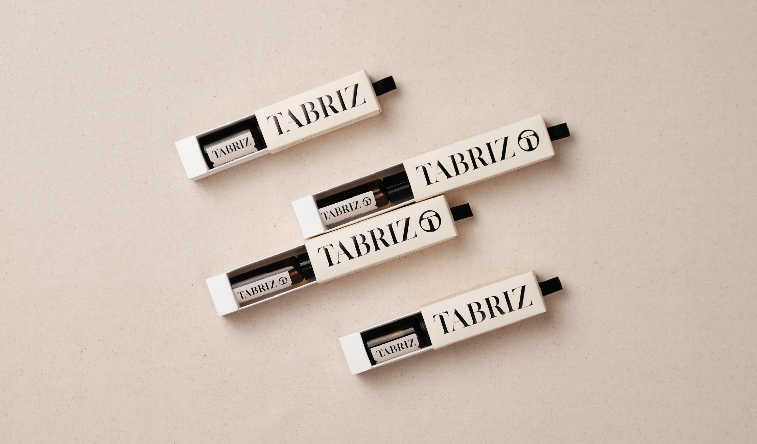
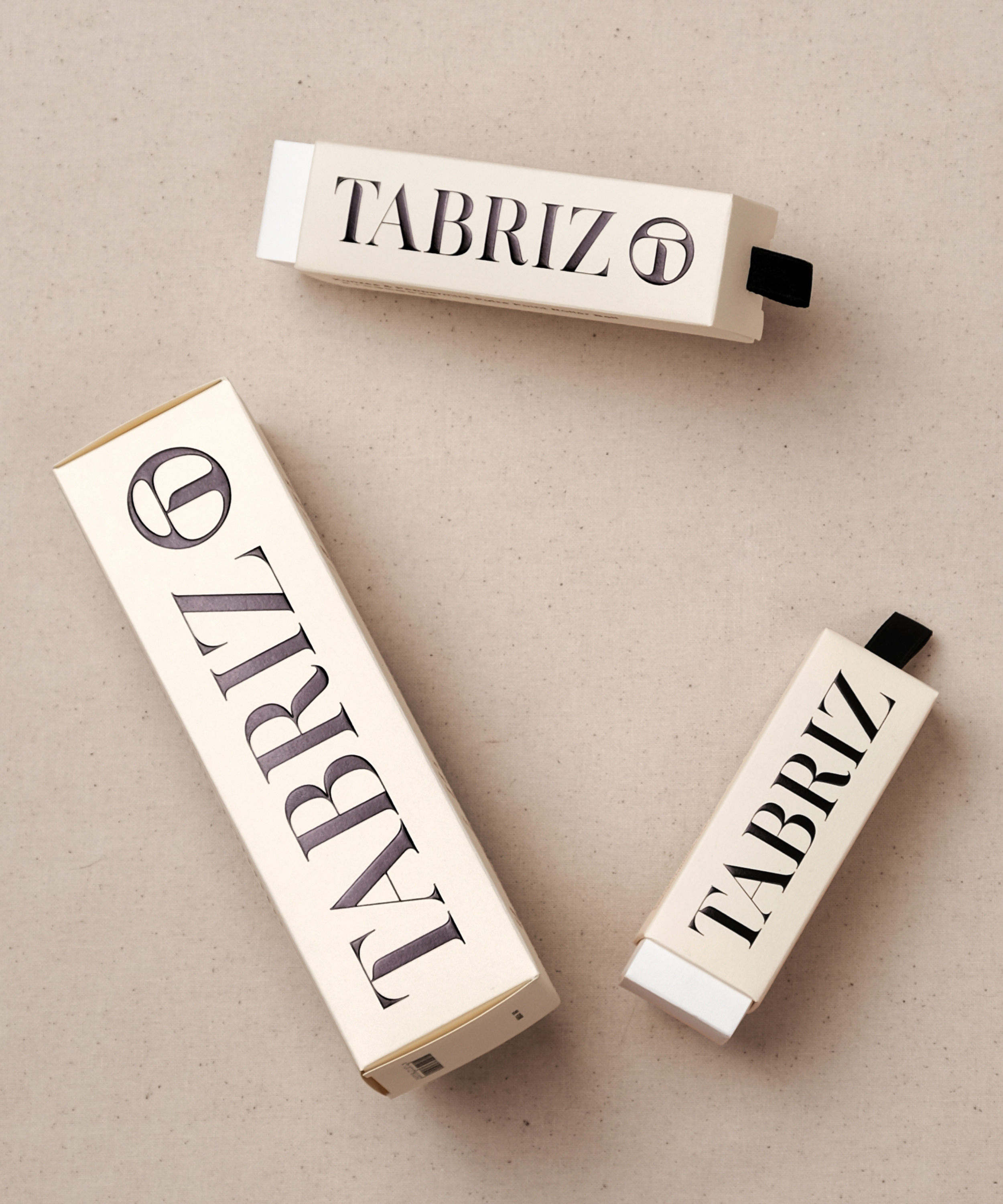
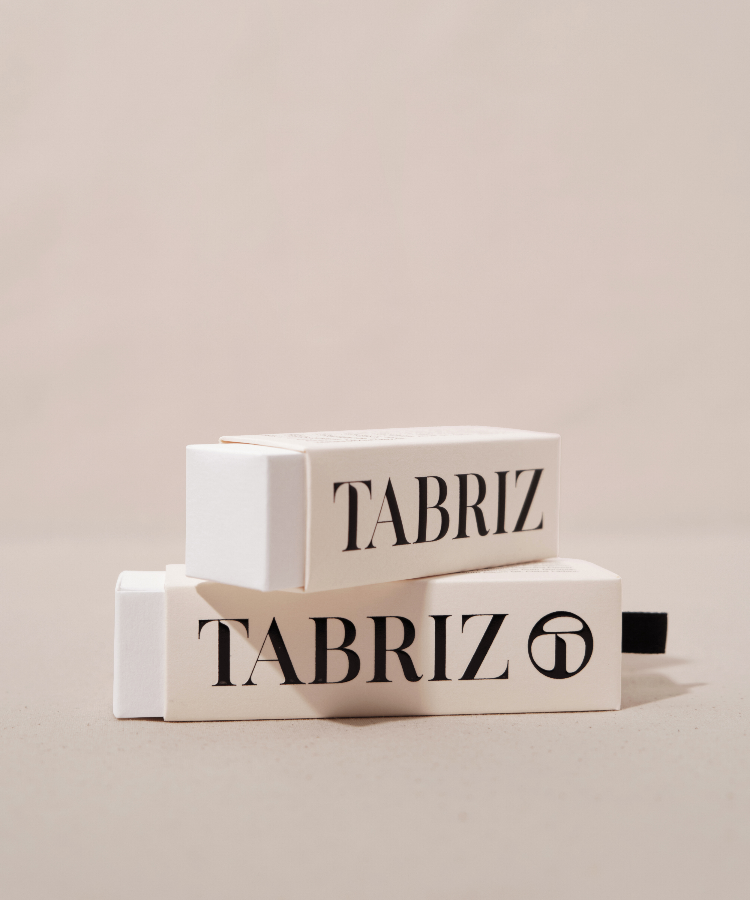
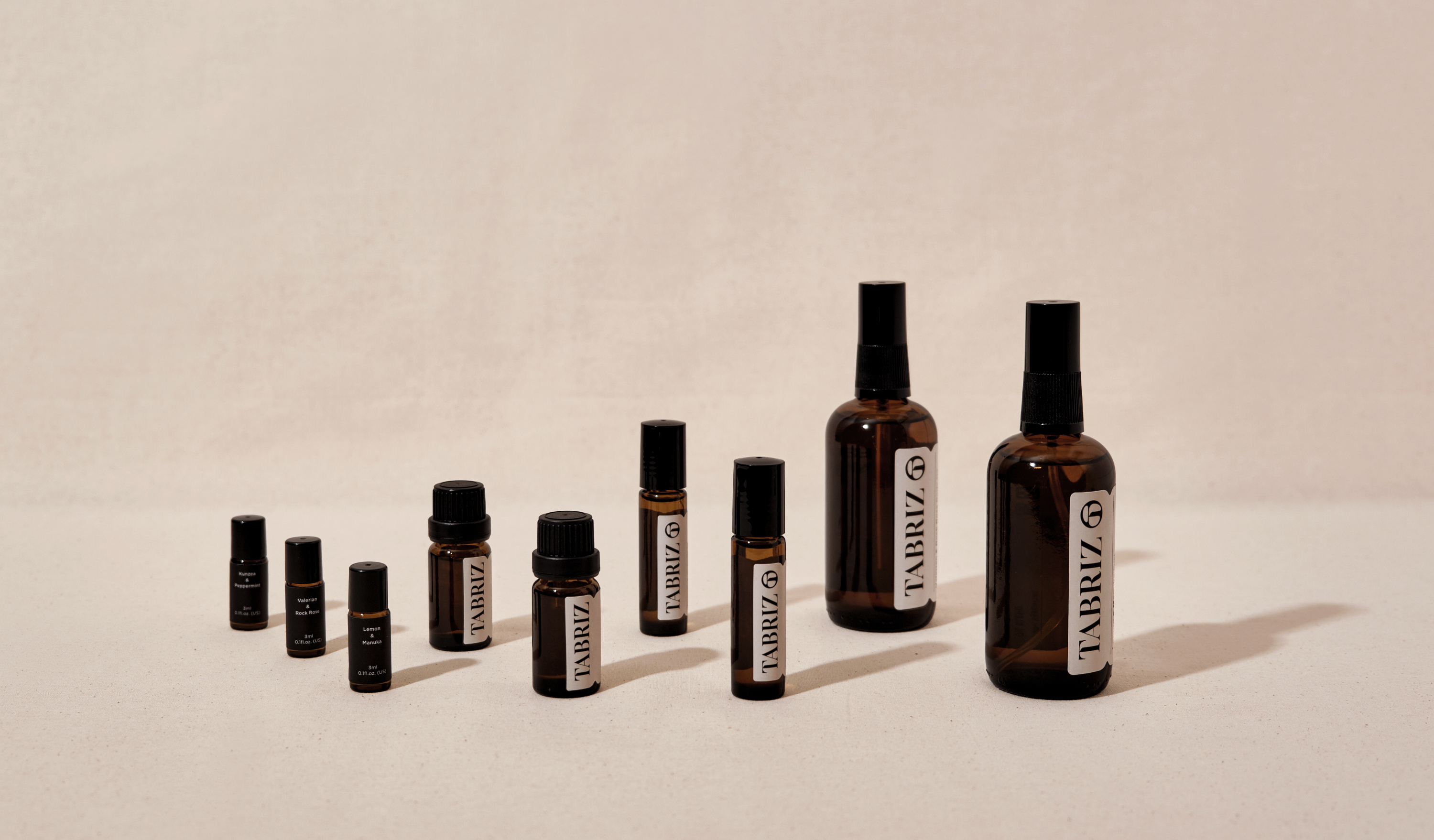
TABRIZ, a brand with 30 years of history in the beauty market, uses its factories to strictly control raw materials and procedures for the high-quality control of its products. To pass down the great feelings from the natural scents, they lead people to explore their inner feelings with the fragrance of essential oils. Combining their professional experience and endless innovation brings a brand new image to the consumer markets.
The brand's logo mark design has the concept of the clarity and transparency of water droplets, combined with the brand name's first letter, "T," to convey the brand's natural and organic goals. For designing the logotype, we bring the logo mark's visual gene and combine it with strong strokes contrast to emphasize independent character in modern visuals. Furthermore, the brand's color scheme choose cream and black to create pure and natural visual feelings.
The overall packaging image extends the brand's goals, creating a natural and organic image. By selecting FSC-certified art paper and its color as brand color, with clean and straightforward visual language, to convey the brand sprint of "KEEP IT CLEAN AND SIMPLE." The print design uses the techniques of embossing and UV printing to deepen the concept of the brand's logo mark, which is like a water droplet. Presenting the logo mainly on the packaging series helps the consumer market remember brand identification.
深耕美容芳療產業 30 年的 TABRIZ 泰莉姿,以自有工廠的作業程序和嚴格把關原料調配確保產出品質的堅持為理念。為了傳達天然氣味的美好、藉由精油芬香引領人們探索內心的感受,TABRIZ 結合自身專業經驗及持續創新的思維,以全新品牌形象走進消費者市場。
標誌圖像以澄澈透明的水珠精華為概念,結合品牌代表性字母 ”T”,連結 TABRIZ 天然有機、化繁為簡的品牌訴求;打造帶有標誌基因、對比強烈的標準字,強調現代且獨立自主的性格。整體色彩規劃以奶油色及黑色為基礎,塑造純淨天然的視覺氛圍。
包裝形象延續品牌期望打造天然、有機的形象感受,選用FSC認證美術紙並取其色樣作為標準色,以直覺與簡約的風格呈現。意圖讓大眾從包裝體驗 TABRIZ 期望傳遞 “KEEP IT CLEAN AND SIMPLE” 的品牌精神。在印刷設計運用打凸及燙色的手法,加深標誌如水珠般透亮的識別概念印象,大面積將識別導入於產品系列包裝的同時,也助於消費市場對品牌識別的記憶度。
T Branding, Packaging Y 2022 CD Chi Tai Lin AD Yu Chien Lin D Allison Hsiao (Packaging), Wei Yun Kan (Identity) PM Yu Chien Lin PH Allison Hsiao C TABRIZ


Related Projects
![]()
![]()
![]()
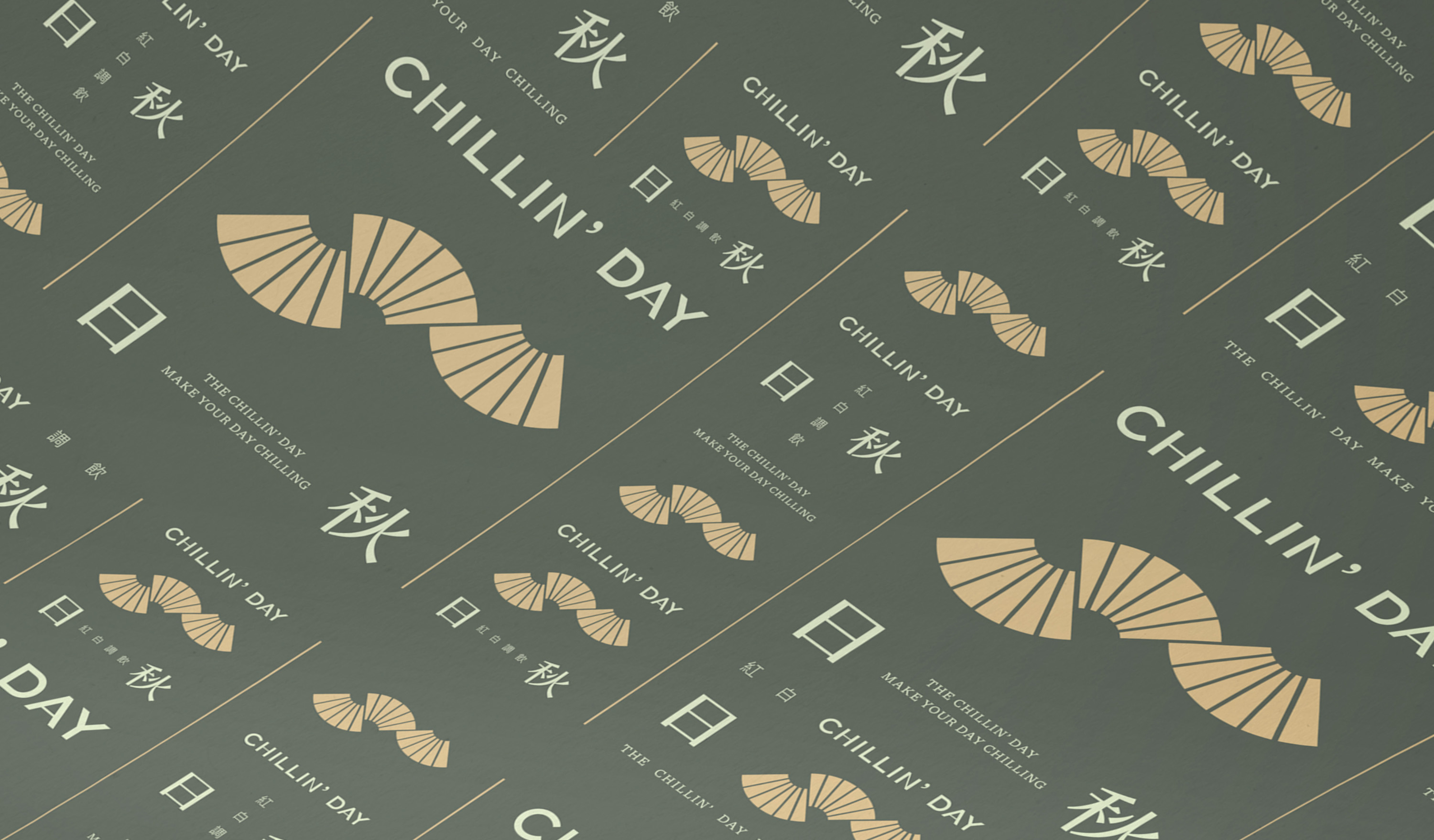
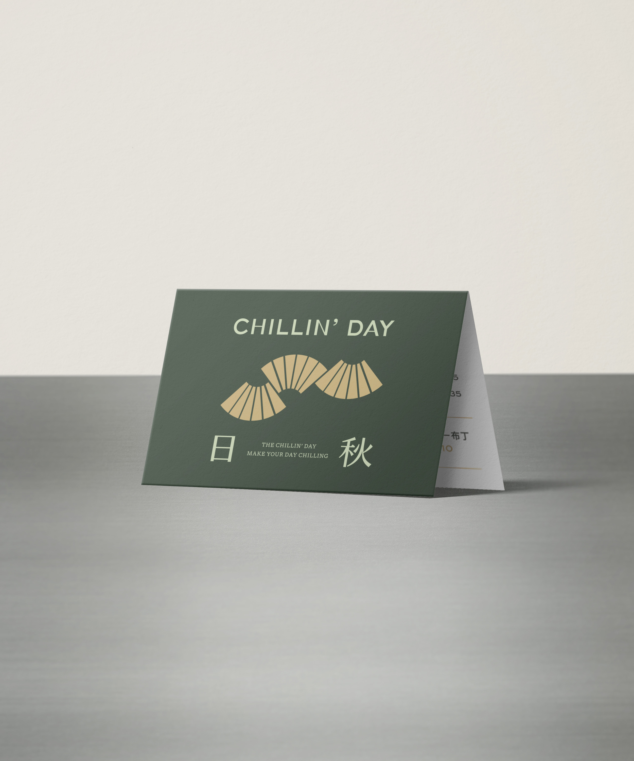
Chillin’ Day
日秋紅白調飲
branding
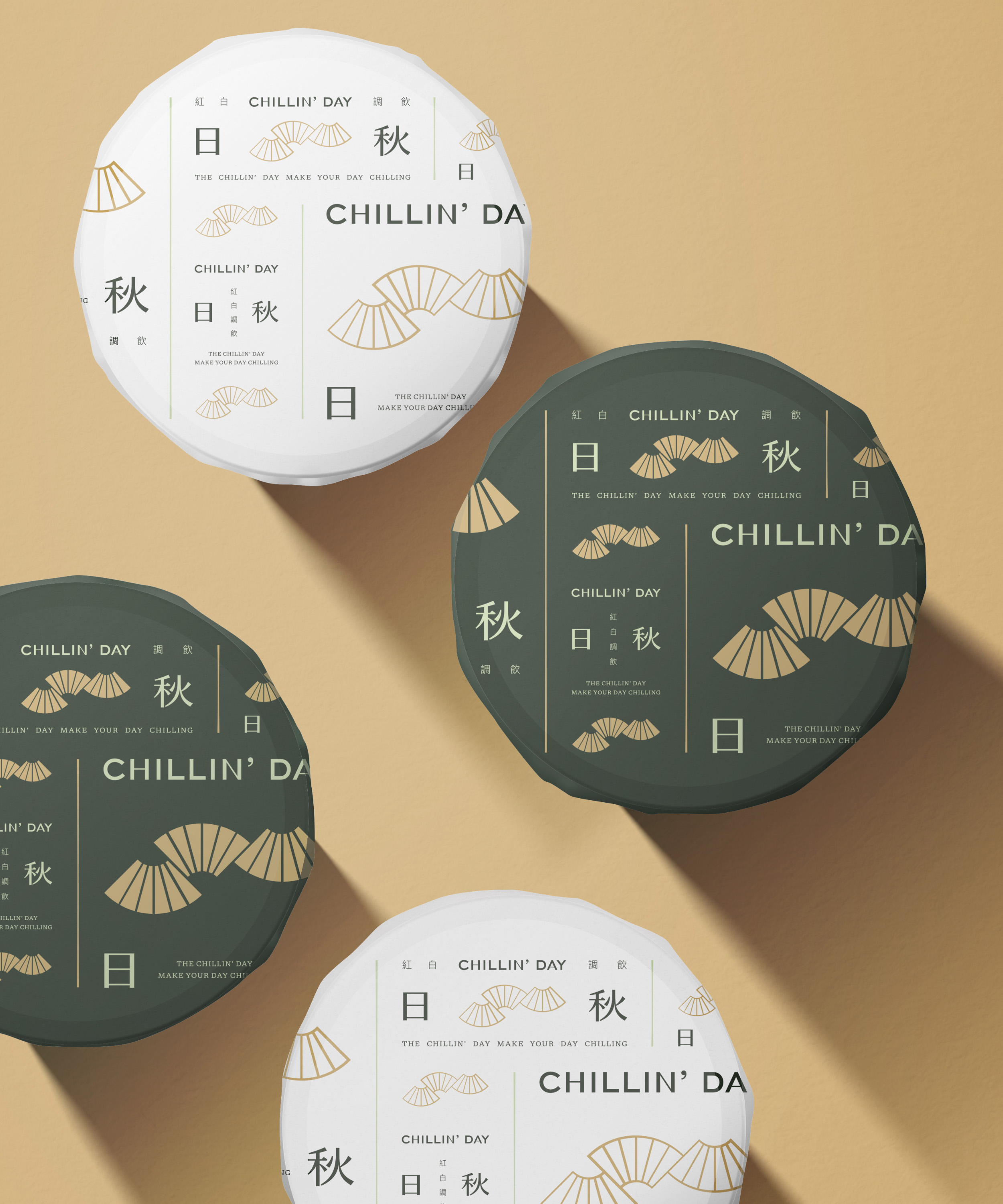
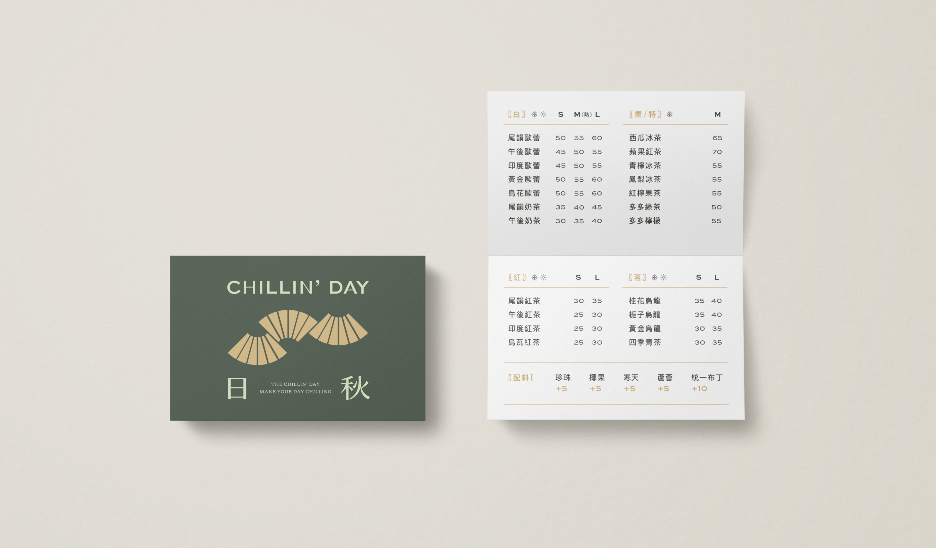
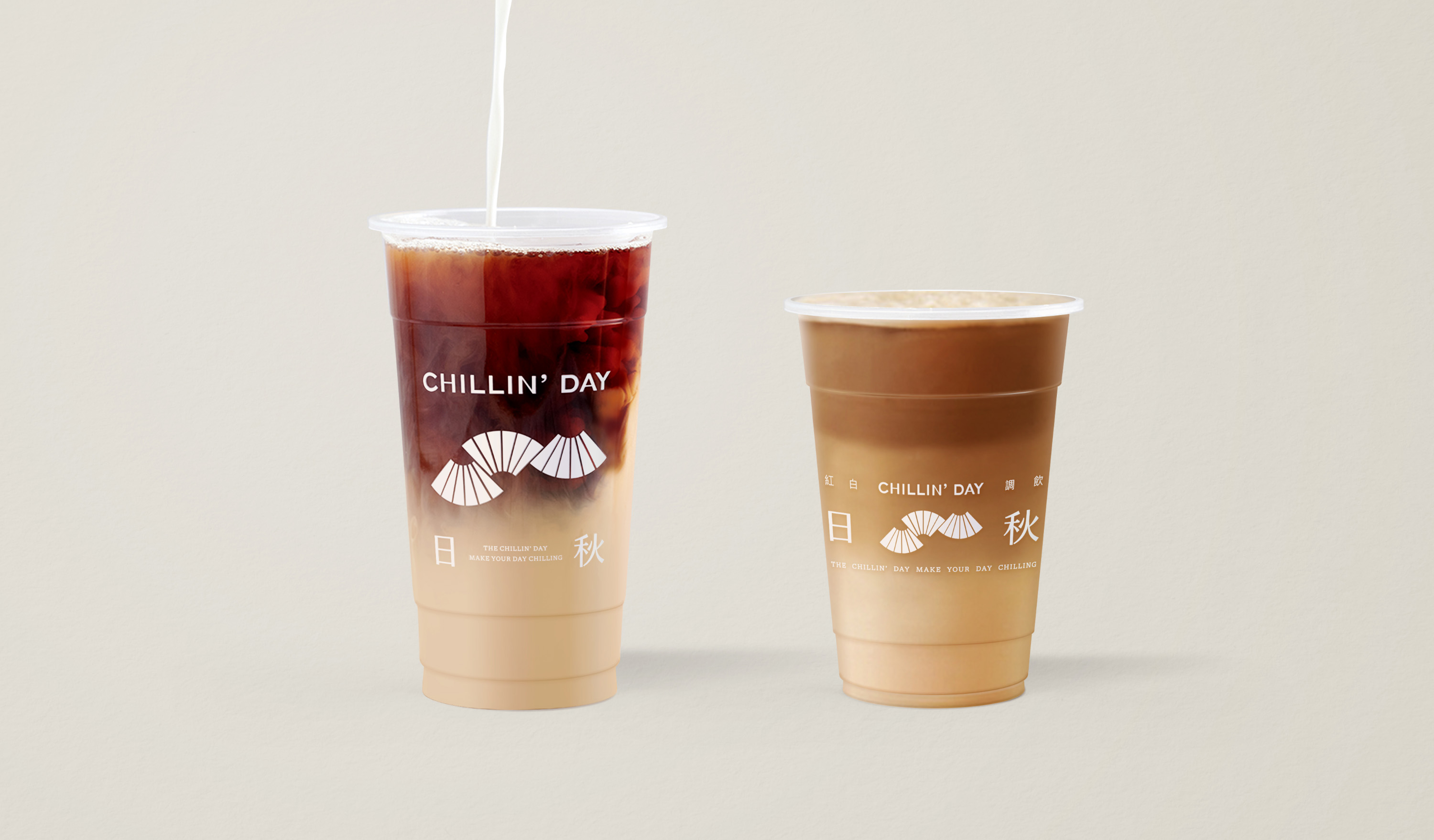
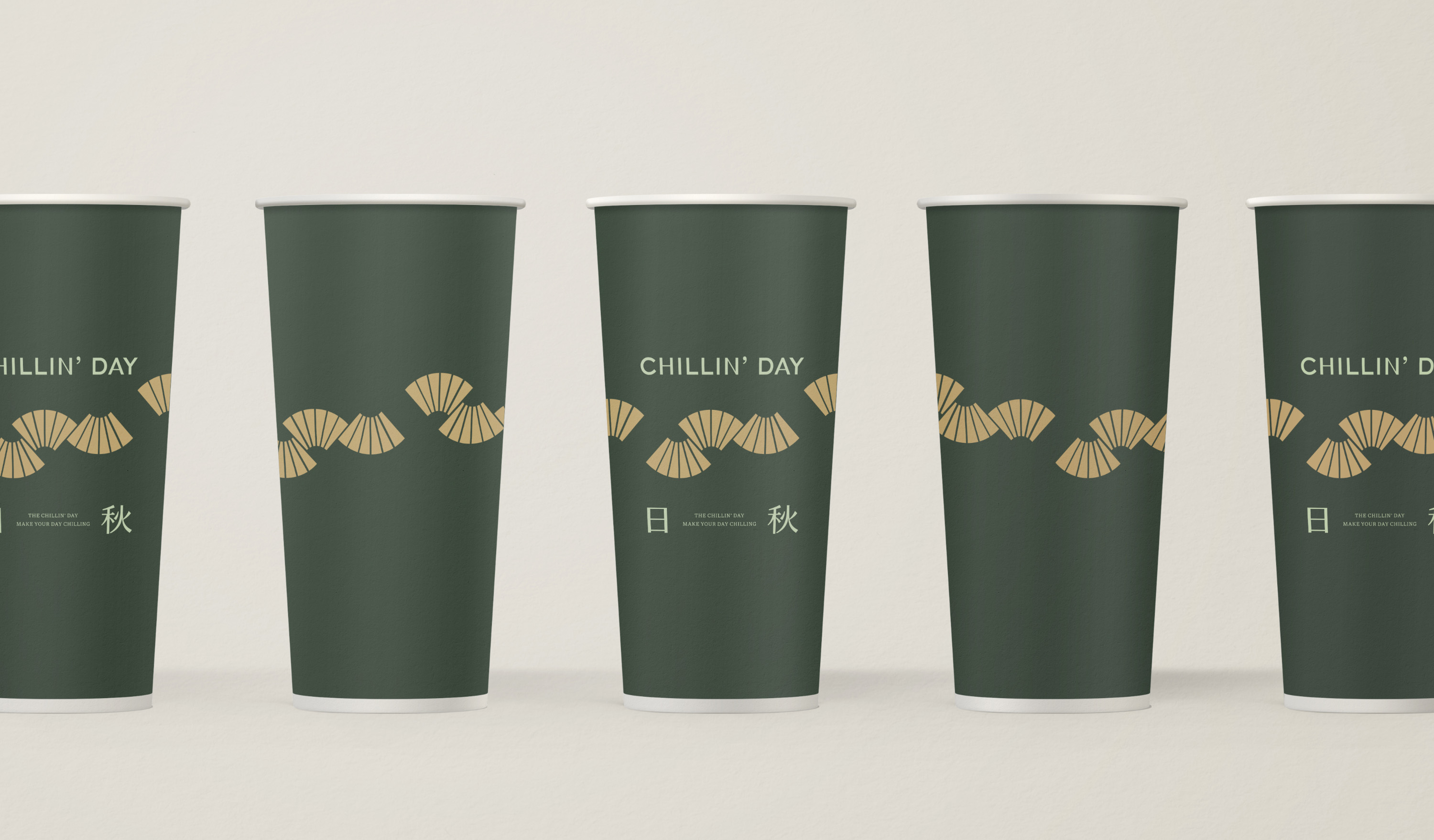
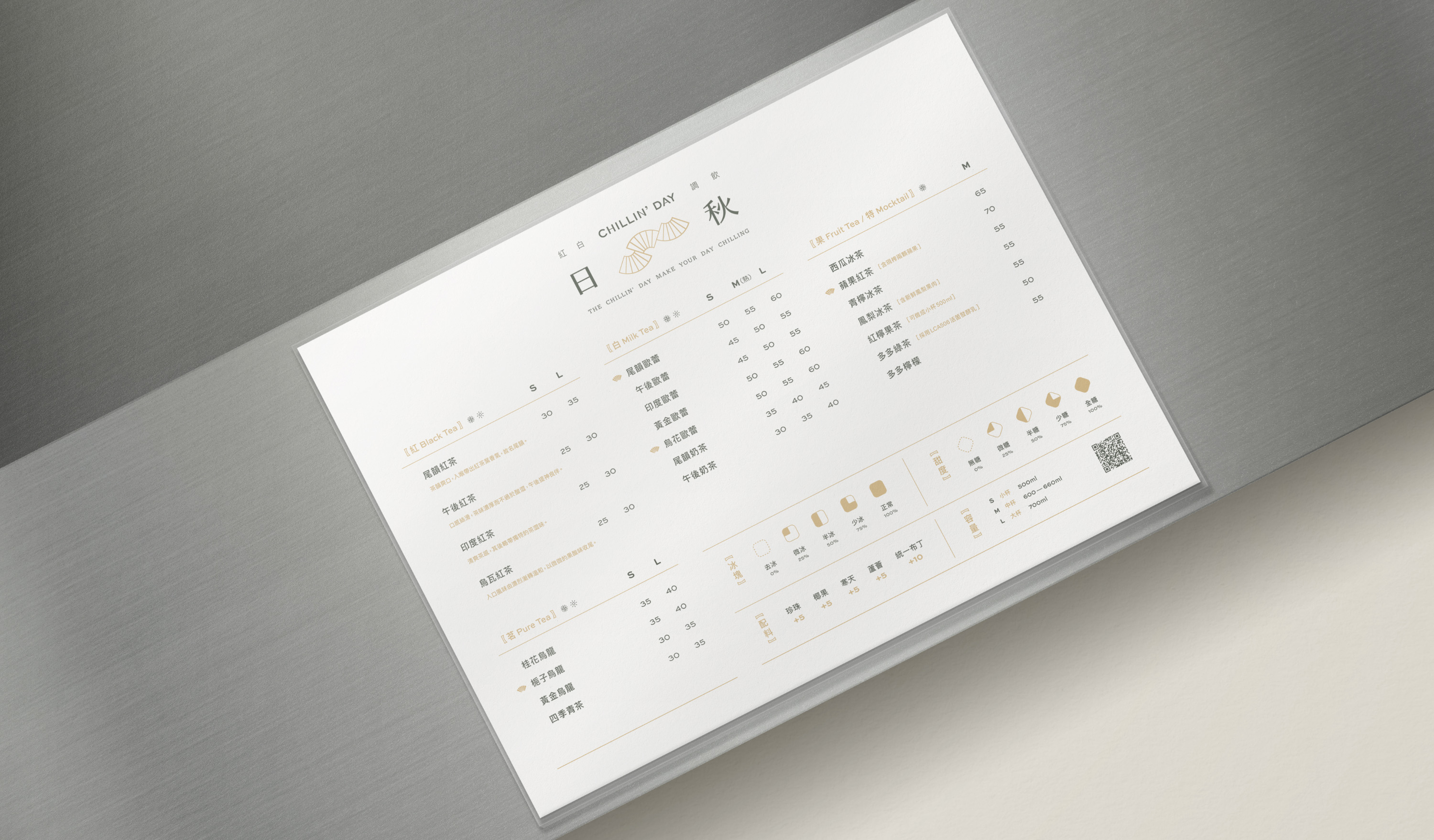
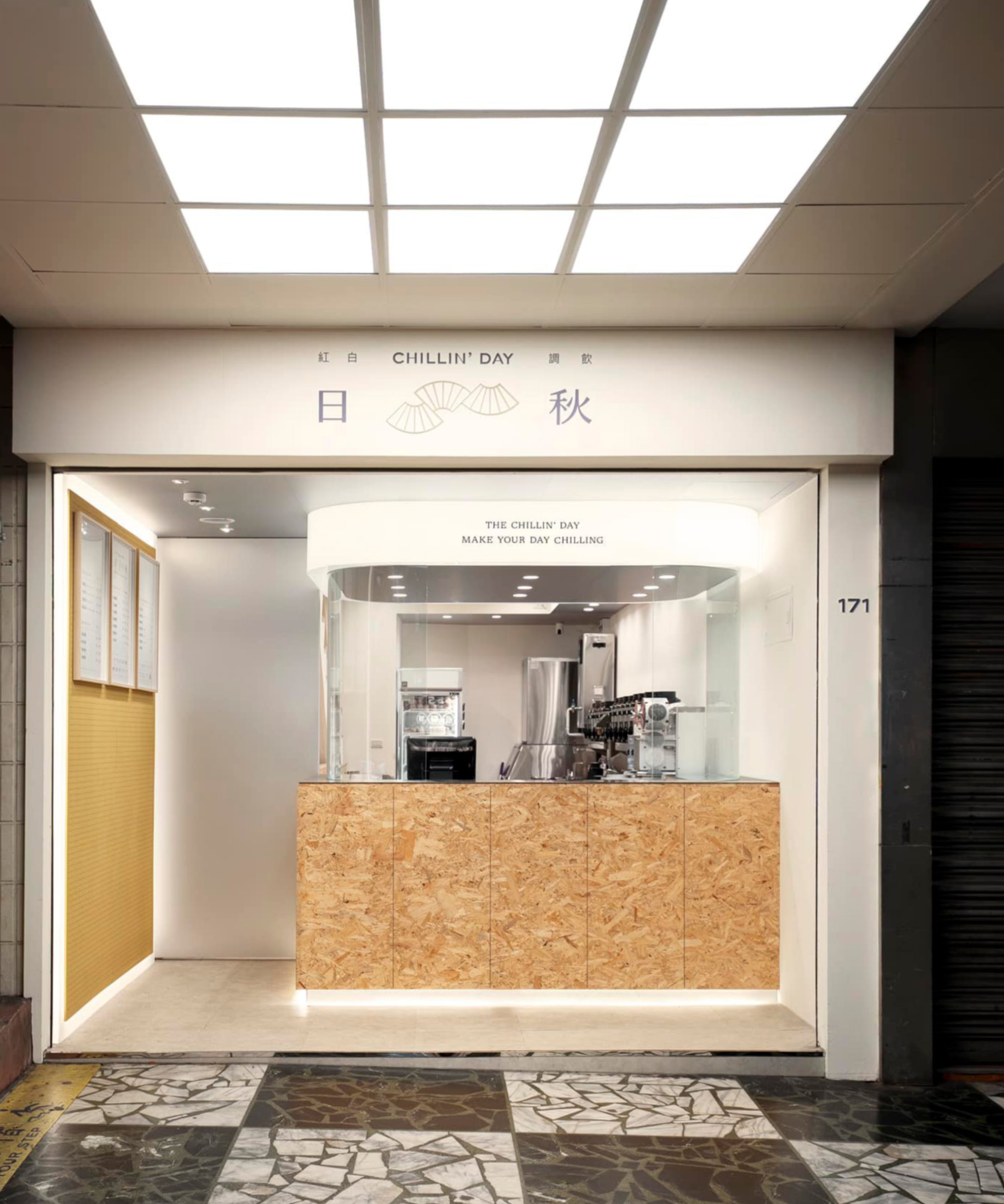
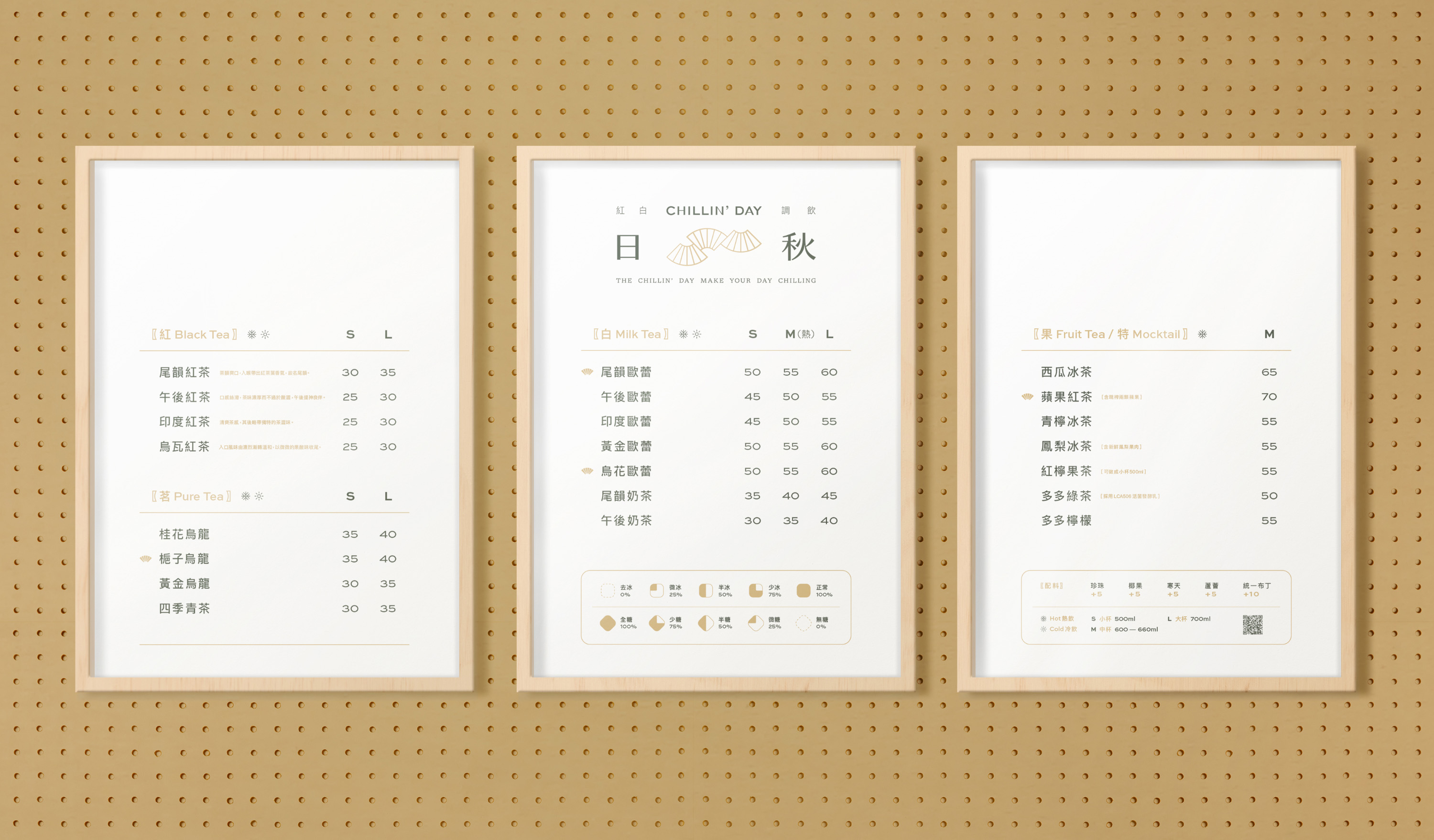
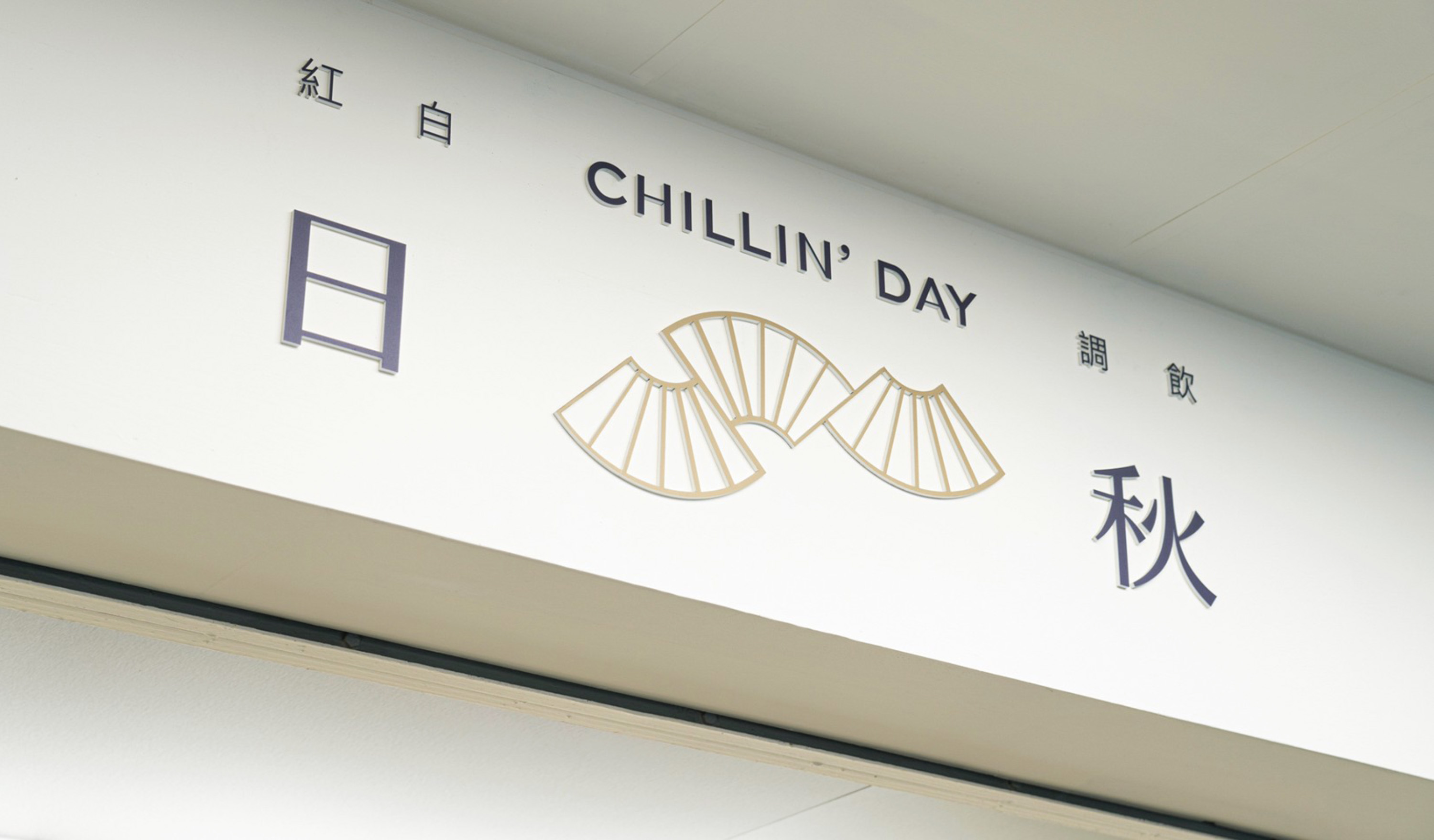
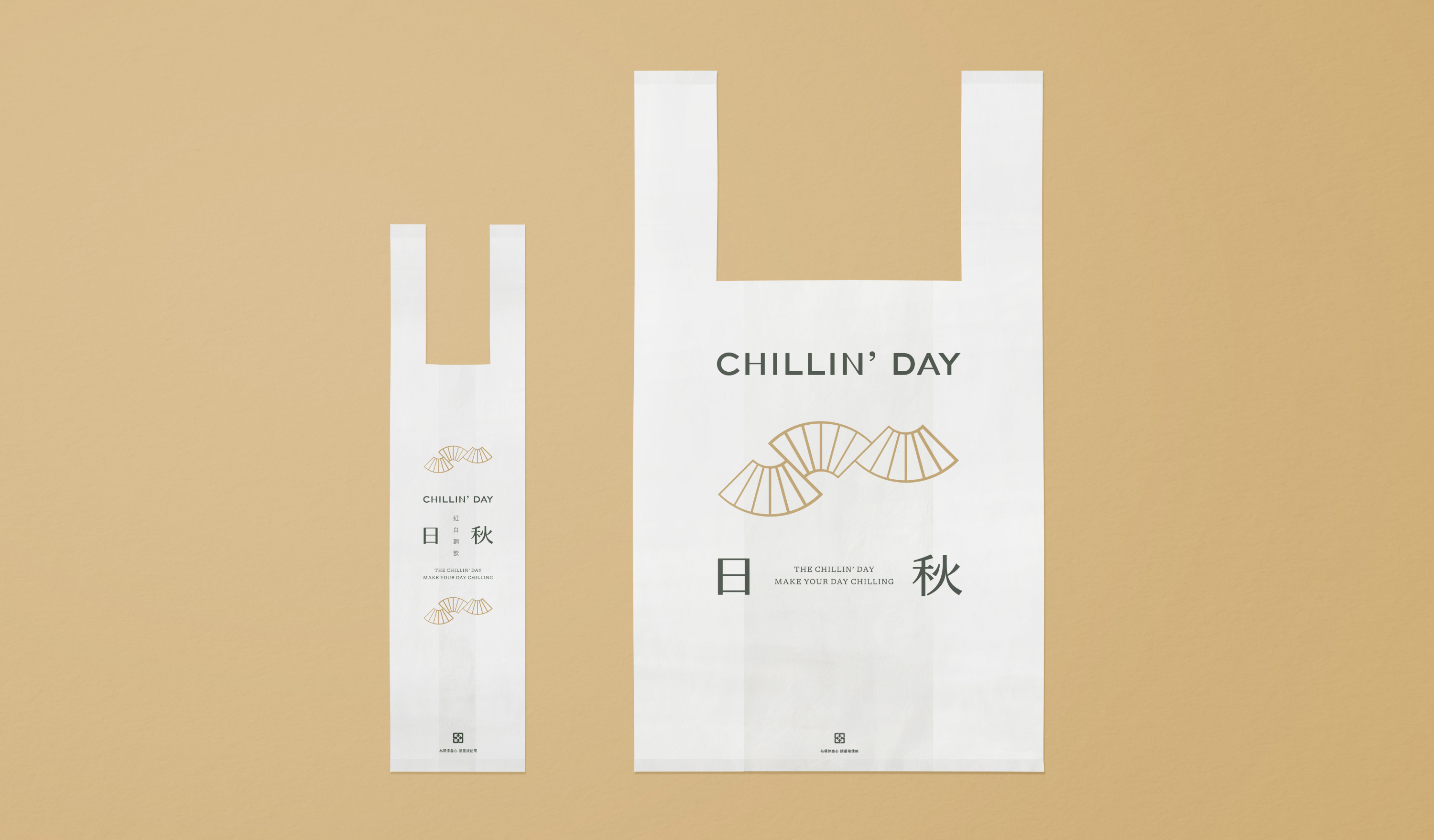
The first store of the “CHILLIN’ DAY” milk tea shop is in Donghu, Taipei. The brand name “CHILLN’ DAY” expresses the brand spirit, with is close to everyday life and provides a relaxing experience. Use a variety of tea and raw materials as based creates delicate and healthy specialty drinks. They hope to offer the local customers high-quality drinks and warm service to give them a break moments in their busy daily life.
For the brand identity, the selected fan shape, which has extended characteristics combined with gradual thickness in lines, portrays the rhythmic image of “autumn wind.” Furthermore, in the application system, through the arrangement of logo combinations, using symbols, logotypes, and slogans repeatedly to deepen the crowd’s recognition.
The selected brand color uses sand, and dark green creates an earth tone color palette to ease the busy life surrounding the store and becomes an oasis in the city. For design applications and brand images, use wide-ranging coverage of brand colors and the brand logo; through brand image experience, customers can hold on to brand sprits with relaxed and chill vibes in daily life.
座落於台北東湖的日秋紅白調飲創始店,品牌名 ”CHILLIN’ DAY” 寄寓了日秋貼近日常生活、提供放鬆體驗的品牌精神。以多樣化的茶種及優良原料為根基,調製健康精緻的特色飲品,日秋以定價親民的高品質茶飲及溫暖親切的服務態度,提供在地族群消費者忙碌生活的身心調劑。
賦有延展特性的扇形構成品牌標誌,藉由粗細漸變的線條呈現「秋風」的律動意象。在應用系統上,以標誌、標準字及標語組成複數不同比例的形式呈現,透過重複排列的手法加深群眾對品牌識別的印象與認同。
品牌色彩選用沙色與深綠色調和出大地色系,象徵日秋在店位周邊繁忙的生活步調裡,讓放鬆的氛圍融入繁忙的日常中,成為城市裡的綠洲。在整體應用延伸與品牌形象規劃,透過大面積的標準色系導入結合品牌標誌的運用,期望透過形象體驗讓消費者延續品牌帶給消費者放鬆寫意的生活感受。
T Branding Y 2021 AD Yu Chien Lin D Wei Yun Kan, Allison Hsiao ID Zhi Ray Wang PM Yu Chien Lin PH Allison Hsiao (Graphic) C Chillin’ Day


Related Projects
![]()
![]()
![]()


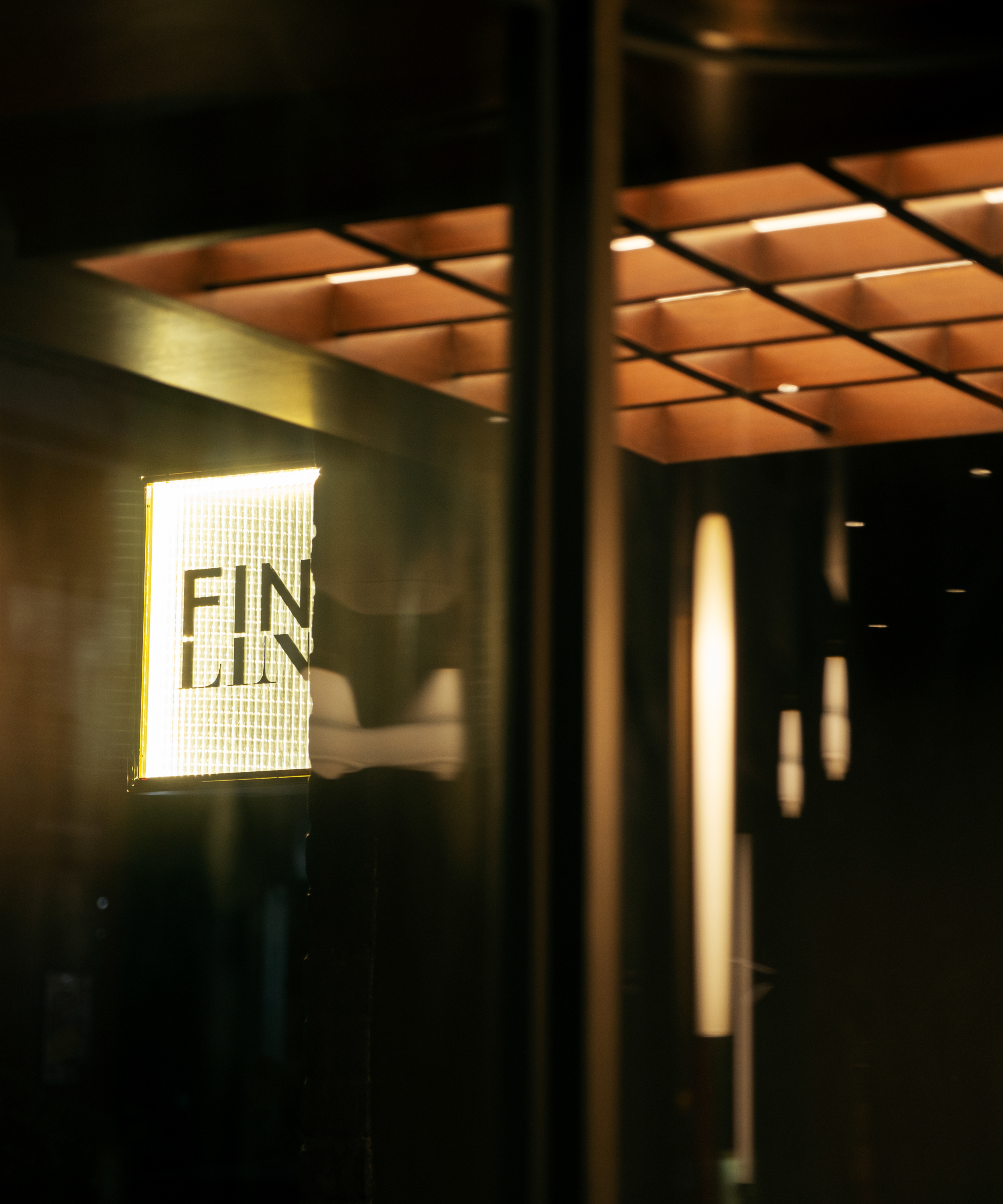
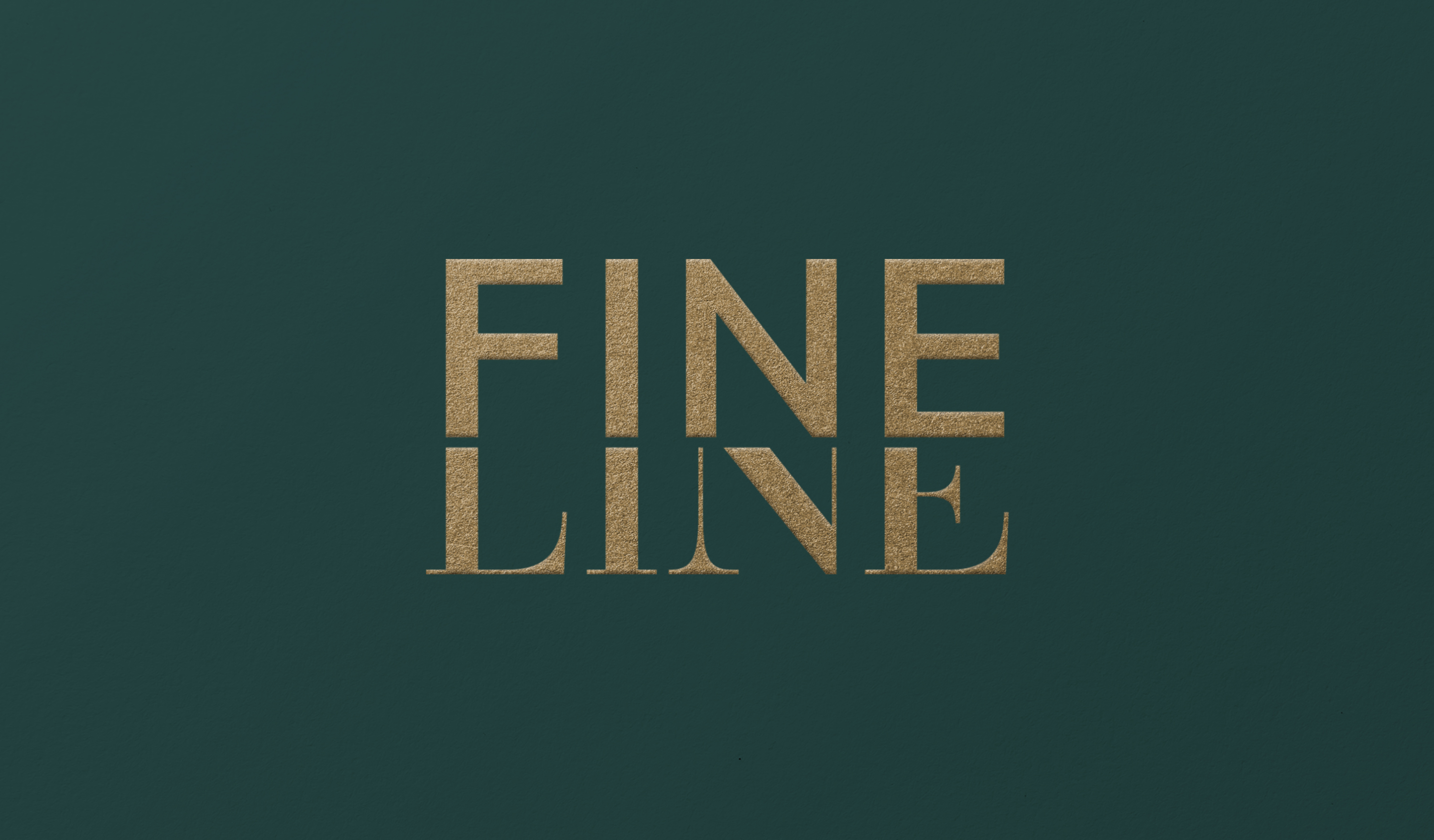
FINELINE
branding
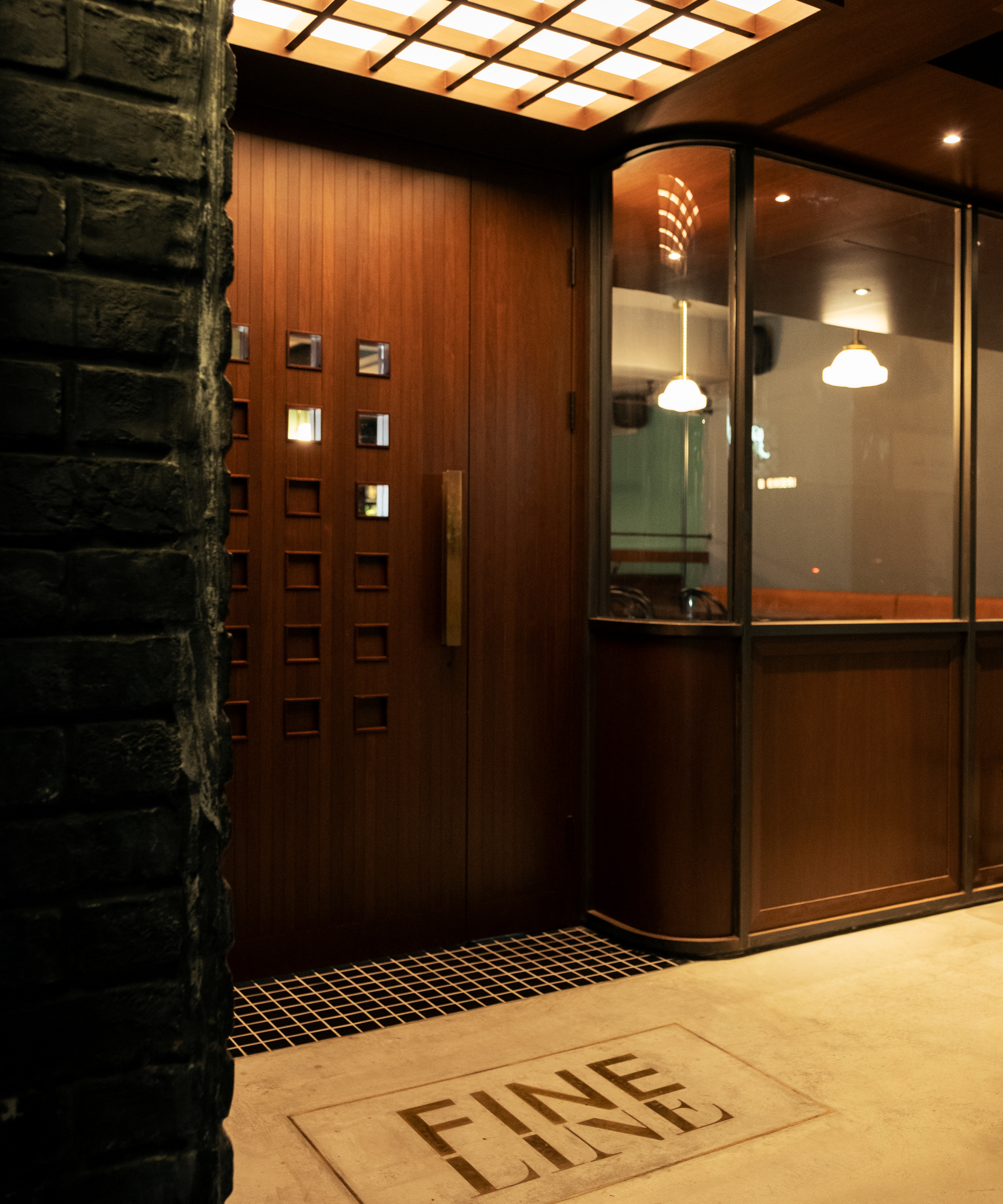
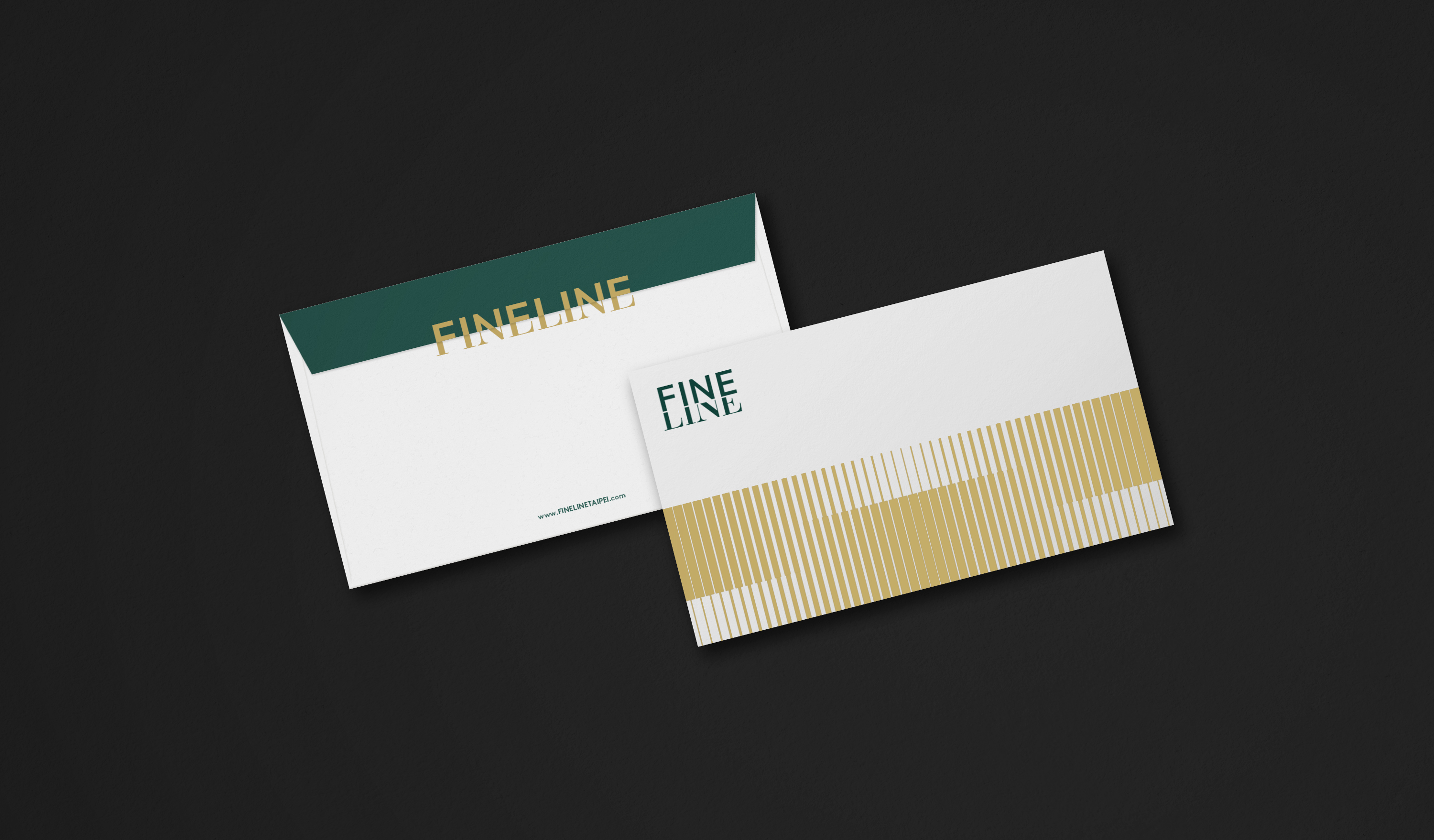
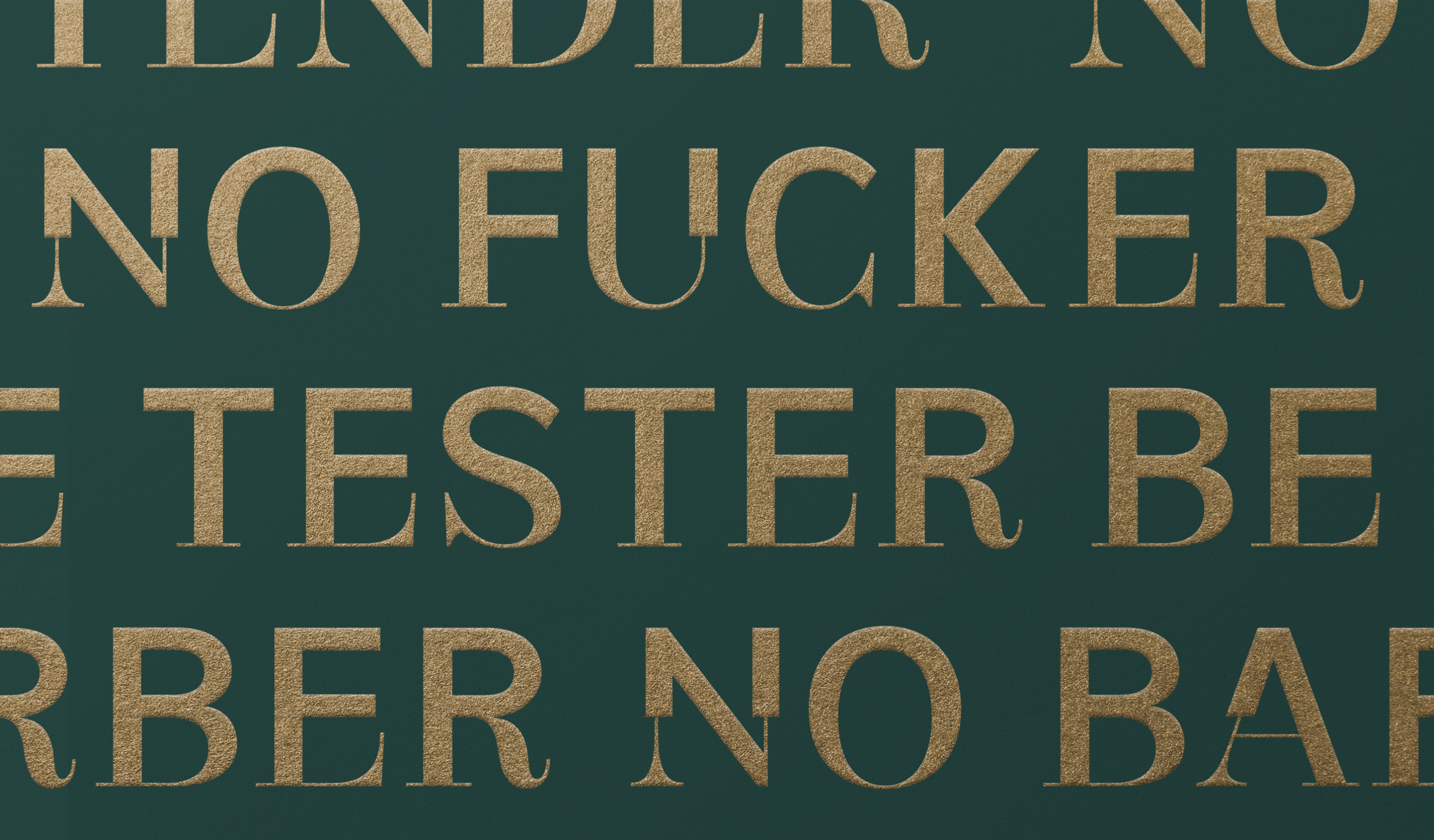
FINELINE is based on the concept of 'the subtle boundary between extreme states'. It embraces innovative thinking that transcends classical and modern standards, unconstrained by frameworks. It cleverly combines the characteristics of serif and sans-serif typefaces to present a unique interpretation of design concepts, drawing inspiration from Optima.
The FINELINE Font continues the spirit of its identity concept, extending from its logo to include 26 uppercase letters, 10 numbers, and various punctuation marks. The font blends characteristics of both serif and sans-serif fonts, presenting a synthesis of differences and expanding upon the context of the extended identity concept.
FINELINE 以「極端狀態間的微細界線」為概念,不受傳統框架侷限、遊走在古典與現代標準之外的革新思維,識別巧妙揉合襯線與無襯線體的歐文字體特色,呈現設計概念的獨特詮釋。
FINELINE Font 延續識別概念精神,從標誌延伸出包含26個大寫字母、10個數字及其他標點符號,字體揉合襯線與無襯線字體特性,表現異中求同、擴展延伸識別概念的脈絡。
T Branding Y 2022-23 AD Yu Chien Lin D Wei Yun Kan, Allison Hsiao PM Yu Chien Lin PH AP Hsiehyise C FINELINE


Related Projects
![]()
![]()
![]()


© 2015 — 2025 不毛 nomo®creative